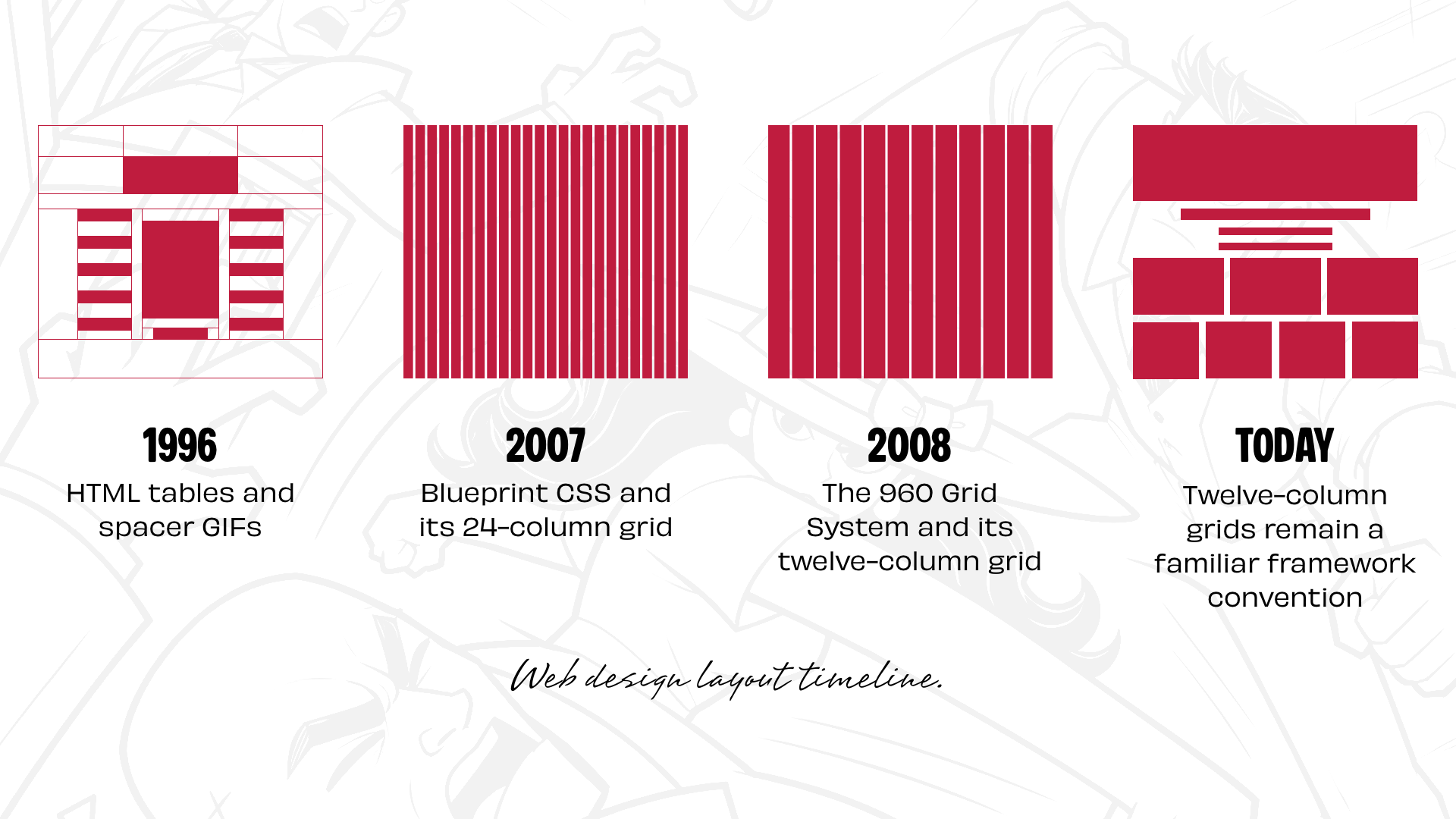
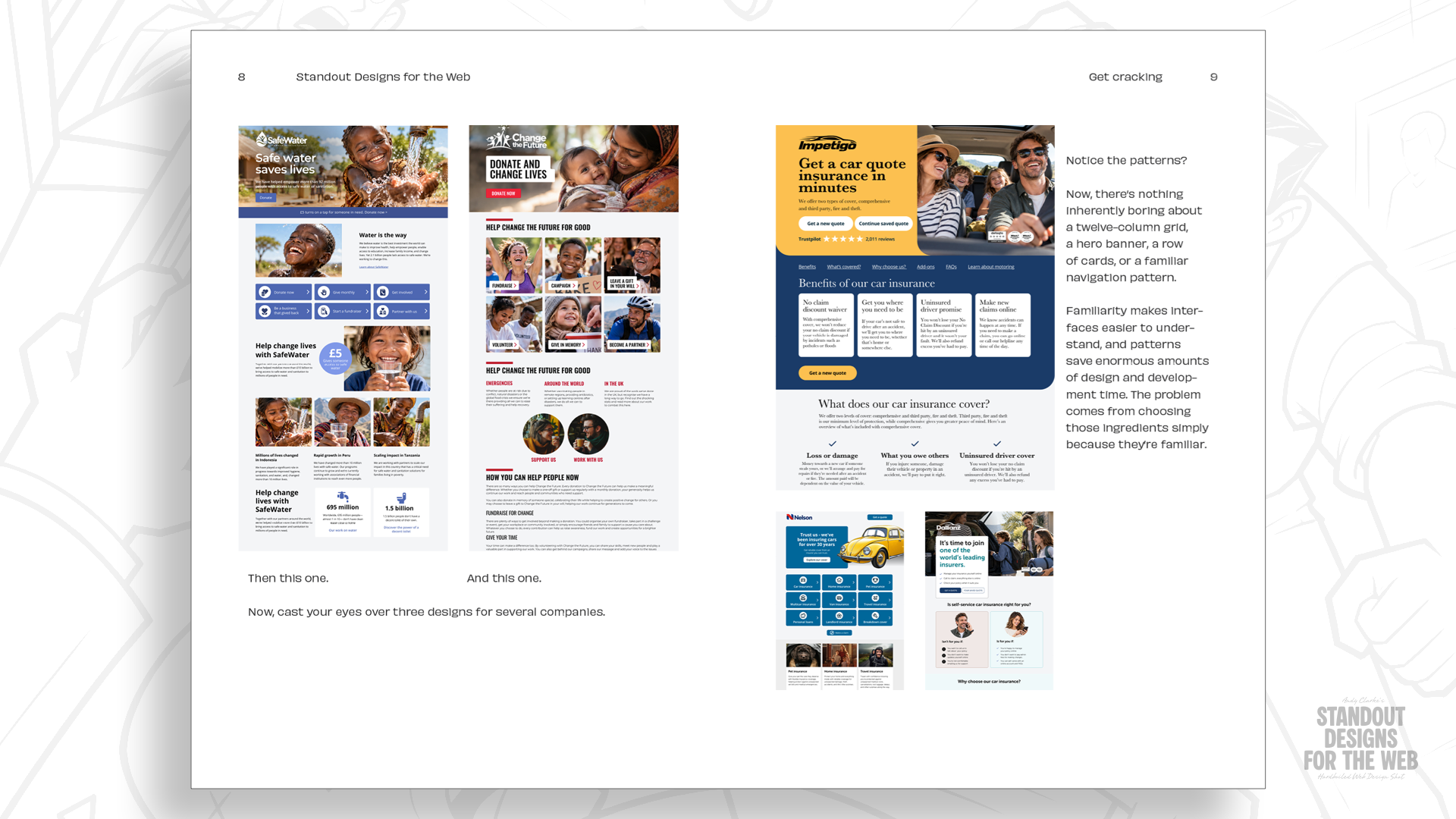
When web design entered a period of standardized frameworks, the industry gained efficiency at the cost of visual uniformity. Reflecting on thirty years of building for the web, veteran designers note how quickly digital architecture gravitated toward a single familiar blueprint. From the early days of HTML tables and spacer GIFs popularized by David Siegel’s Creating Killer Web Sites, to the float-based positioning of early CSS, layout creation has always been driven by the search for structural control. Yet, the introduction of CSS frameworks offering ready-made grid systems—such as Blueprint CSS with its 24-column layout and Nathan Smith’s 960 Grid System featuring 12- and 16-column options—cemented a shared approach to planning and building pages.
Over time, twelve-column grids emerged as the undisputed standard for digital design, reinforced by popular frameworks like Bootstrap and Foundation. While twelve-column systems make basic mathematical sense—allowing easy division into halves, thirds, and quarters for the standard 2-up, 3-up, and 4-up components seen across the internet—their ubiquity has created a modern design challenge. Even with the advanced capabilities of CSS Grid, many digital creators still begin projects by dividing a canvas into twelve equal columns before attempting to fit content inside. The resulting websites are often functionally adequate, but they risk looking remarkably similar, relying on a familiar starting point rather than considering the unique identity of the brand behind the screen.
Every Company Has a Story Worth Telling
The central issue is not the twelve-column grid itself, but the tendency to reach for a default solution before examining what makes a company distinctive. Effective layout design does much more than simply arrange content into orderly rows and columns. The physical size, relative positioning, and visual relationships between elements actively shape how users experience a digital space. A restrained, highly organized composition communicates a very different message than one built around energy, asymmetry, and movement.
To illustrate how alternative approaches can reshape digital
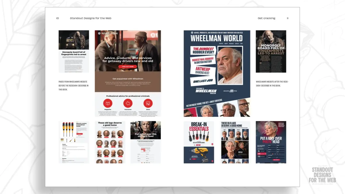
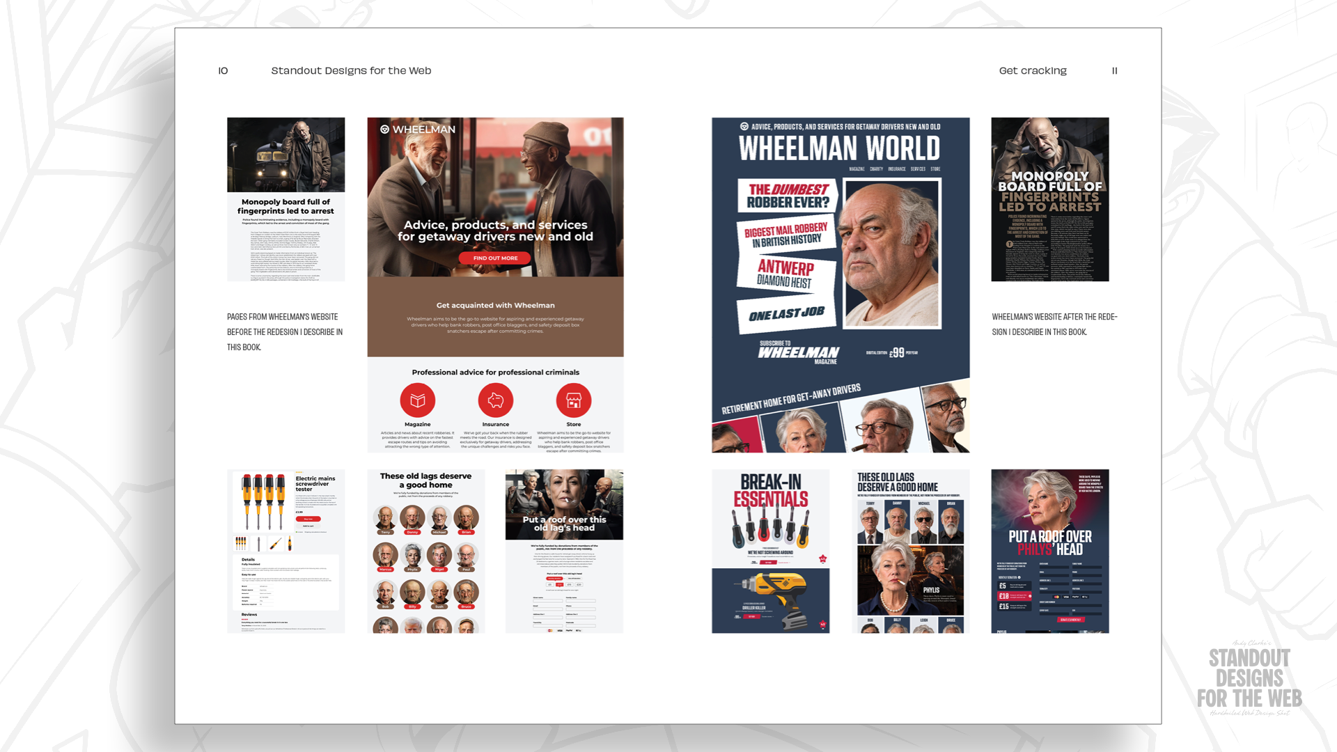
experiences, industry practitioners often turn to conceptual examples that push creative boundaries. In his upcoming book, Standout Designs for the Web, designer and author Andy Clarke explores these principles through Wheelman, a fictional company created to address very real design challenges. Wheelman provides products and services tailored for getaway drivers, ranging from legal advice and robbery insurance to an online shop featuring break-in essentials, alongside a publication dedicated to stories about life behind the wheel.
Because Wheelman is far from an ordinary enterprise, its digital presence requires a distinct approach. Its audience demands professionalism, yet the brand itself possesses a rebellious, adventurous personality. Forcing such a company into a standard corporate template would miss an opportunity to tell its story effectively. While customers still need to navigate the site, understand offerings, and complete transactions smoothly, those interactions become significantly more memorable when the underlying layout matches the character of the organization.
Starting with Content, Not Columns
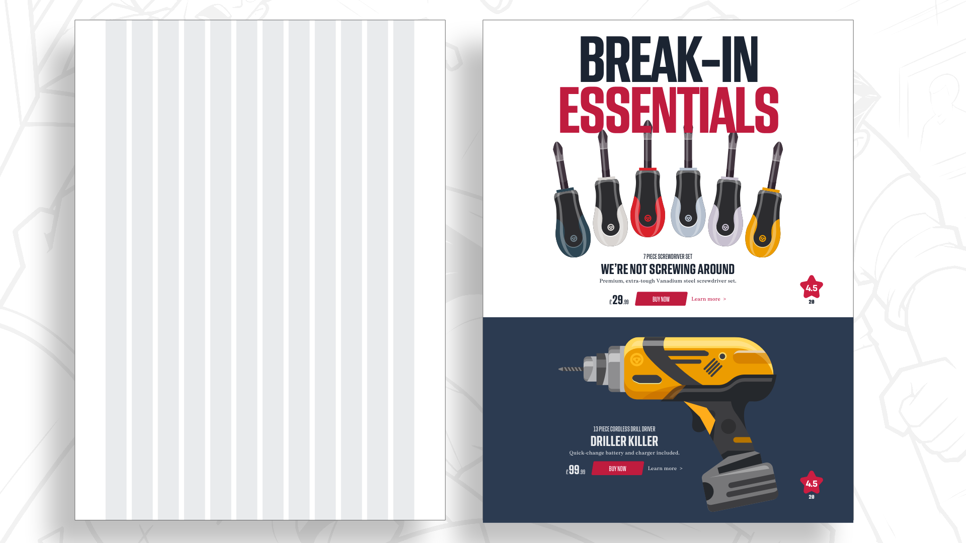
Designing with personality rather than defaulting to preset grids begins long before the first column is drawn. Consider the process of creating a landing page for Wheelman’s online shop, which features prominent products alongside bold headlines and standard e-commerce functionality. Rather than immediately dropping these assets into a twelve-column structure, designers can begin by analyzing the relationships between the elements and asking fundamental questions about visual storytelling.
This discovery phase focuses on qualitative decisions rather than mathematical divisions. Questions center on whether a large, immersive photograph would properly set the scene, how to make an introductory statement more impactful, and how whitespace can be utilized to guide the human eye and create moments of pause. By determining what the layout needs to accomplish from a narrative perspective first, the choice of grid becomes a supportive tool rather than a restrictive constraint.
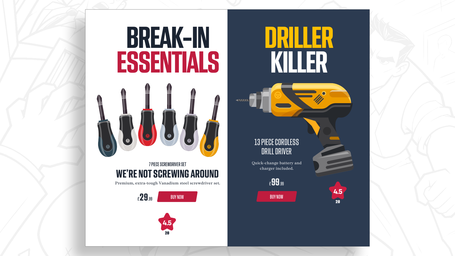
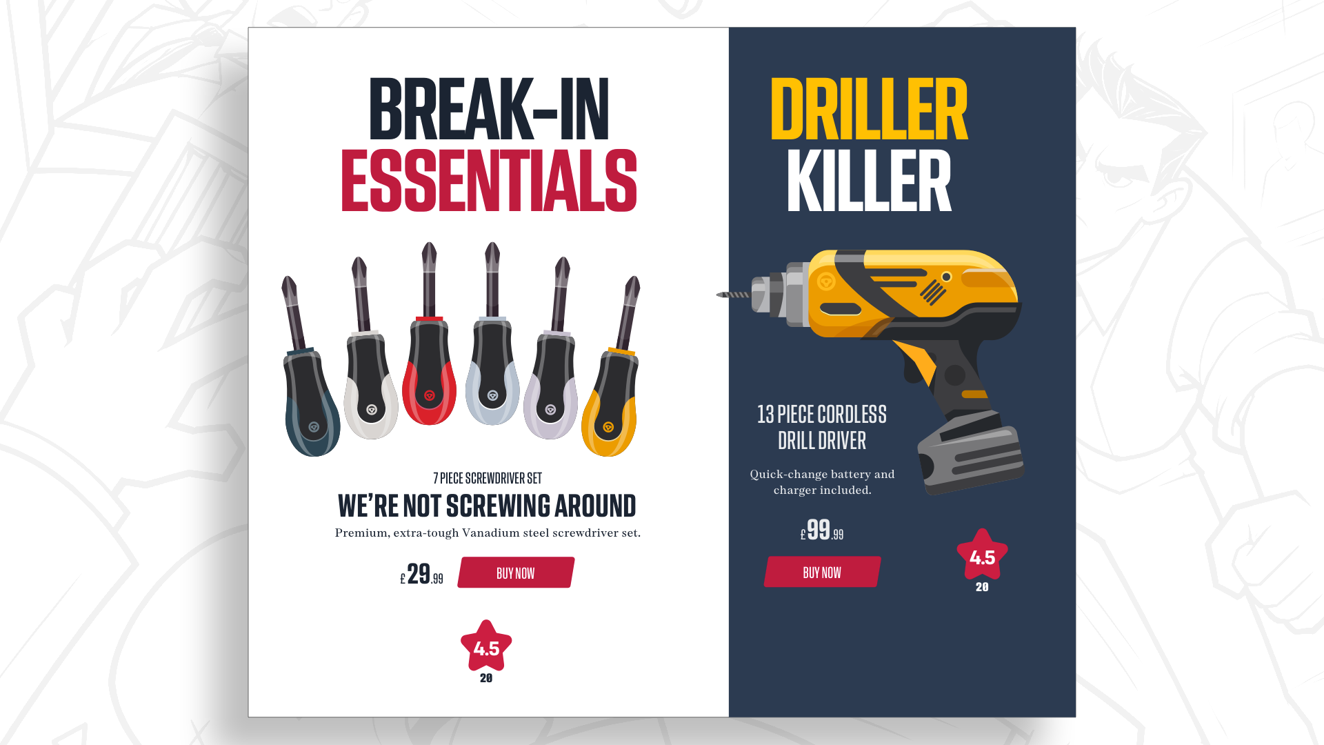
While a single-column layout offers a straightforward reading experience and simplifies responsive design implementations, it may fail to capture the energetic spirit of a brand like Wheelman. Experimenting with equal-width columns provides both products with equal prominence, while shifting those proportions creates an immediate visual hierarchy without altering the scale of the core elements. However, relying solely on column-based divisions only organizes space vertically, leaving an opportunity to introduce a second dimension through modular design.
Adding Another Dimension with Modular Grids
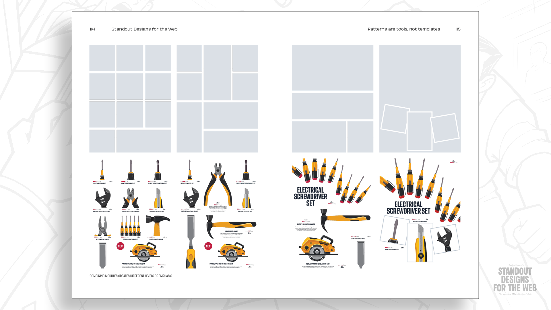
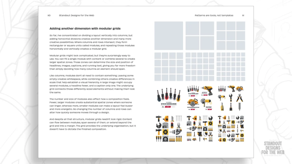
Dividing a page layout horizontally and vertically creates intersecting lines that form rectangular and square units known as modules. Combining these individual modules allows designers to establish larger spatial zones, control whitespace with greater precision, and inject variety into a composition.
Utilizing a modular grid makes it possible to build drama, vary element scale, and craft arrangements that feel engaging rather than predictable. For instance, establishing a structure of four columns and four rows yields sixteen distinct modules. A designer does not need to fill every available space uniformly; instead, a large graphic headline and primary product image can span across multiple modules, while accompanying text and interactive shopping tools occupy smaller, dedicated spaces.
Within a product grid, alternative items can be distributed unevenly—some occupying a single module while others expand horizontally or vertically. This intentional variation in size gives selected products greater visual prominence, ensuring the overall layout avoids the monotony of standard e-commerce templates. The resulting page maintains a clear reading order and allows content to breathe, while unmistakably reflecting the distinct identity of the brand. As screen sizes change, the size and quantity of modules can be adjusted to preserve an optimal reading experience, demonstrating the flexibility inherent in multi-dimensional layouts.
Mixing Grids to Create Compound Grids
Variety remains essential for complex websites where different sections serve distinct purposes. A magazine, an online shop, and a customer service portal require unique functional arrangements, meaning that forcing every page into the exact same structural template compromises the user experience. Compound grids offer a solution by providing rigorous organization alongside room for unconventional compositions.
A compound grid integrates two or more distinct grid systems—such as column, modular, or hierarchical grids—within the same webpage. These structures can overlap, sit side by side, or stack vertically, generating layout possibilities that neither grid system could achieve on its own. For example, overlaying a two-column grid with a three-column grid creates four distinct columns of varying widths, offering greater flexibility without sacrificing underlying alignment.
These varied proportions create sophisticated opportunities for content placement. A wider spatial zone can house a prominent photograph or headline, while a narrower section accommodates a pull-quote or supplementary text. Expanding this approach to combine grids with different column counts—such as mixing four- and five-column structures—allows separate pages across a site to feature unique compositions while maintaining a cohesive visual language. The ultimate goal is not to introduce difference merely for the sake of novelty, but to ensure that every section of a website is supported by a layout tailored specifically to its content.
Moving Past Familiar Solutions
While twelve-column grids remain a valuable asset in the modern web designer’s toolkit, they represent only one option among many. Beginning every creative project with the exact same structural default can limit possibilities before the core message of a design has even been considered. Although traditional 2-up, 3-up, and 4-up layout patterns certainly have their place in everyday development, reaching for them automatically leaves little room for the unique character that makes digital experiences truly memorable.
Embracing alternative layout strategies encourages designers to make more deliberate choices regarding color, typography, imagery, and structural composition. Projects that successfully break away from predictable templates demonstrate that consistency does not require every page to look identical; rather, different designs can share an overarching visual language while retaining their own distinct personalities.
Pre-orders for Standout Designs for the Web are currently open through the CSS-Tricks store, with publication scheduled for November. The book aims to encourage digital creators to look beyond familiar solutions and make more intentional decisions about how visual elements come together, ensuring that websites ultimately look and feel like they genuinely belong to the organizations behind them.