As the web development landscape shifts into a new season, developers are greeted with a fresh wave of cutting-edge features, innovative techniques, and creative problem-solving strategies. The latest edition of the web development community’s top updates brings together a diverse collection of breakthroughs, ranging from advanced tooltip behavior and syntax highlighting APIs to upcoming selector improvements and layout balancing tools.
Among the most prominent discussions in the community are modern approaches to tooltips. Abhishek Jakhar recently explored why tooltips should ideally feature a delayed trigger followed by an instant disappearance. This pattern prevents accidental activations when users sweep their cursors rapidly across a page, while ensuring that once a user is finished interacting with the element, the tooltip vanishes without frustrating lag. Jakhar demonstrated practical implementation methods for this behavior. However, experts note that if the hoverable trigger region is too compact, developers must carefully calibrate the delay to avoid unintended de-triggering.
Building upon this concept, Chris Coyier introduced a modern implementation leveraging interest invokers. These rely on two specialized CSS properties: interest-delay-start and interest-delay-end. While browser support for interest invokers is currently limited to Chrome, this approach serves as a prime example of progressive enhancement in action, allowing developers to adopt forward-looking capabilities safely while maintaining fallback experiences for other platforms.
The <geolocation> Element and Modern Location APIs
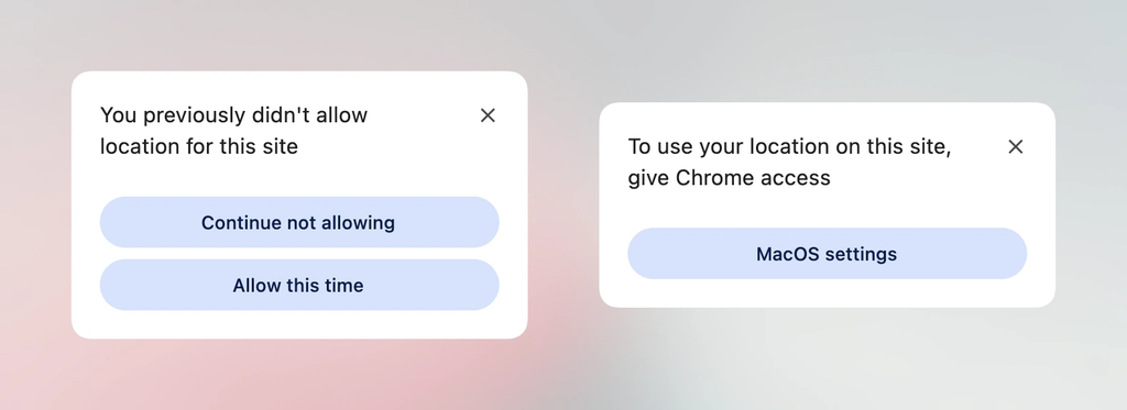
Progressive enhancement remains a central theme across recent web platform updates, particularly with the introduction of the new <geolocation> HTML element. Historically, working with the Geolocation API has been notoriously complex due to the heavy reliance on external hardware like GPS satellites, Wi-Fi networks, and cellular towers. Furthermore, managing and altering permission statuses after an initial user choice has long been a source of developer frustration.
The new <geolocation> element aims to alleviate many of these traditional hurdles, though it introduces its own set of unique design quirks, including specific styling restrictions. Because widespread cross-browser support is still developing—with Chrome currently leading the way—developers are exploring integration strategies that pair the new element with the traditional Geolocation API. This hybrid approach enables teams to experiment with and deploy native location elements today without breaking functionality for users on unsupported browsers.
MicroLighter and the ::highlight() API
Syntax highlighting on the web is also undergoing a renaissance, thanks to modern browser capabilities. Dave Rupert recently developed MicroLighter, a lightweight syntax highlighter built upon the Custom Highlight API and utilizing the ::highlight() selector. Rupert and fellow developers have shared insights into how this new API allows for efficient, DOM-friendly text highlighting that bypasses traditional heavy JavaScript-based parsing libraries. The community has warmly embraced these lighter, more performant approaches to rendering code snippets on documentation sites and blogs.
Capturing CSS Grid Layout Information
In layout engineering, Temani Afif unveiled a technique for passing CSS grid information directly into CSS custom properties. By capturing layout metrics—specifically the number of rows, columns, and the exact X and Y coordinates of individual grid cells—developers can unlock dynamic styling possibilities that were previously impossible without heavy JavaScript intervention.
While this technique currently requires columns to have uniform widths, the ongoing evolution of CSS suggests that such constraints may soon loosen. Afif demonstrated how this grid metric extraction can be harnessed to calculate hover proximity, opening up sophisticated, spatial interactive designs that respond fluidly to cursor movements relative to grid cells.
The Ongoing Debate Over Dark Mode Toggles
User interface preferences continue to spark spirited debates among frontend architects, particularly concerning dark mode toggle implementations. Lea Verou has advocated for a straightforward two-state toggle system, whereas Bramus has made a compelling case for a tri-state approach that explicitly handles light, dark, and system-default settings. Meanwhile, other voices in the community, such as Vale.Rocks, have championed an auto-until-overridden two-state model. This hybrid philosophy respects the user’s operating system preferences by default while gracefully preserving manual overrides when a user explicitly chooses a specific theme.
Emerging Selectors and Feature Detection
Looking toward the future of CSS syntax, Bramus introduced the concept of the class prefix selector. Although not yet supported in production browsers, this proposal promises a cleaner and significantly more performant alternative to traditional attribute selectors. Instead of relying on complex substring matching rules like [class^="something-"] or [class*=" something-"], the proposed prefix syntax allows developers to target multiple related classes with concise, native syntax. Given its simplicity and practical utility, industry observers anticipate strong momentum toward standardisation and implementation.
In addition to class selectors, Bramus highlighted the new @supports named-feature() function, which is already supported in Chrome. This feature detection mechanism allows developers to query hyper-specific browser behaviors that were previously undetectable, such as whether a specific rendering engine respects CSS transforms when positioning anchored elements. This advancement is expected to make the @supports rule substantially more robust for managing complex layouts across different browser versions.
Balancing Wrapped Flex Items
Layout balancing has also received a notable upgrade with the introduction of flex-wrap: balance in Chrome. Drawing inspiration from the popular text-wrap: balance property used in typography, this new flexbox capability automatically distributes wrapped flex items evenly across rows or columns. Ahmad Shadeed recently detailed how this feature works and highlighted practical use cases where developers can prevent awkward, lopsided final rows in flexible user interface components.
As these diverse features—ranging from innovative syntax highlighters and grid metrics to native HTML elements and advanced flexbox balancing—continue to mature across web browsers, developers have a rich toolkit at their disposal to build more resilient, performant, and sophisticated user experiences.