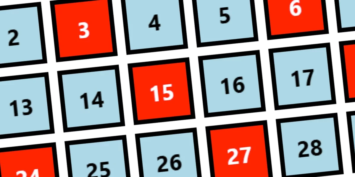
For years, web developers have relied on static rules to style elements on a page based on their position in the DOM. The venerable :nth-child() pseudo-class has long been a staple of modern web design, allowing creators to target alternating rows, specific columns, or complex numerical sequences with ease. However, this power has historically come with a rigid limitation: the arguments passed into the function must be hardcoded at compile time. If a developer wanted to dynamically change a sequence, such as shifting from every third element to every fifth element on the fly via custom properties, they were simply out of luck.
That limitation is now being challenged as developers experiment with bleeding-edge browser features. By combining upcoming specifications like the inline if() conditional function, container style queries, and specialized sibling functions, front-end engineers are successfully re-implementing the native :nth-child() behavior entirely through dynamic CSS variables. While rebuilding an existing browser feature might initially seem like an exercise in redundancy, the exploration offers a profound look at the future capabilities of stylesheet architecture and provides developers with a powerful toolkit for runtime layout manipulation.
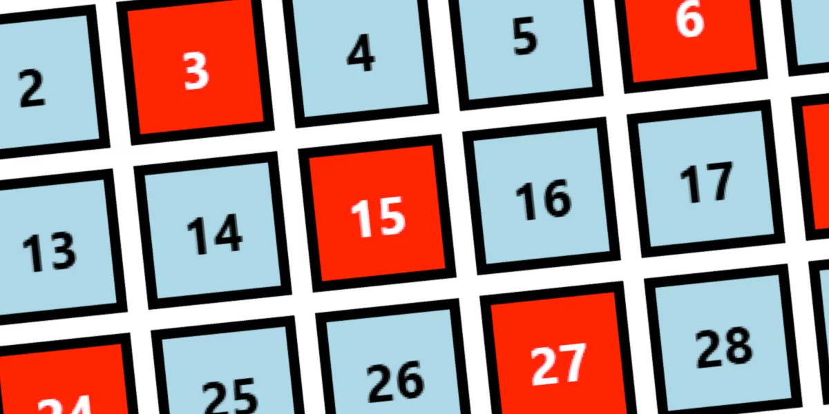
The primary motivation behind this endeavor is the desire to adjust :nth-child() arguments dynamically without manually rewriting CSS selectors. Traditionally, applying a repeating pattern requires a fixed mathematical expression baked directly into the stylesheet, such as targeting every fifth element offset by eight. Changing those parameters requires going back into the code, editing the selector, and recompiling or reloading. Developers have long desired the ability to pass CSS custom properties directly into the function—allowing values to shift in response to user interaction, state changes, or container adjustments—but the native syntax does not support variables in that manner.
By leveraging newly emerging CSS features, however, that theoretical flexibility is becoming a reality. The approach relies on a standard HTML structure, typically a parent container holding a series of child elements, where the container manages custom property variables that dictate the targeting logic.
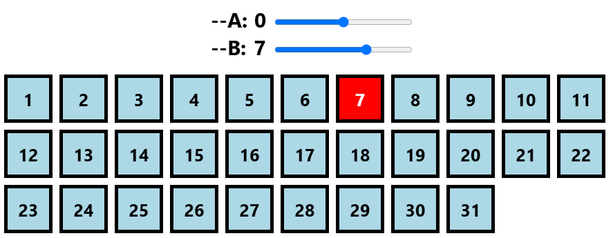
The simplest case involves targeting a single element by its exact index, traditionally written as a fixed integer inside the selector. By moving to the new inline if() syntax, developers can evaluate conditions directly within a property declaration. Using style queries that check the element’s position relative to its siblings through structural functions, stylesheets can now evaluate whether a specific condition is met and apply styles accordingly. If the condition holds true, a specified color or layout change is applied; otherwise, a fallback style takes over.
This technique extends naturally to range selections and inequalities. Traditional selectors can target elements starting from a specific index onward or cap them at a maximum threshold. Replicating this behavior dynamically involves evaluating whether a sibling index is greater than, less than, or equal to a designated variable. By chaining these evaluations or combining them into range queries, developers can create fluid, responsive selection windows that adapt instantly to changing variable values defined at the container level.
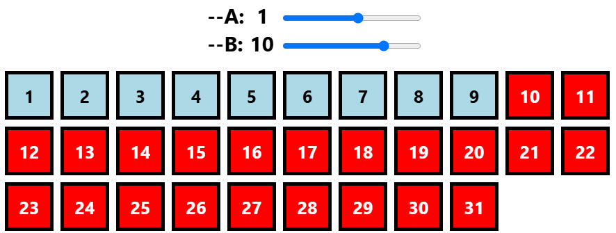
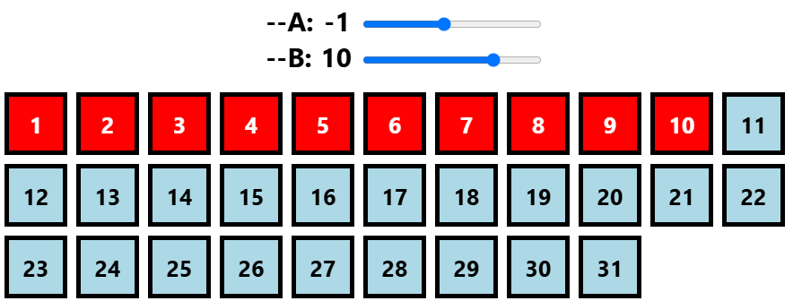
Tackling repeating patterns—the classic An argument structure that targets every nth element—introduces the need for mathematical operations within the stylesheet. Developers can achieve this by utilizing modulo functions to check remainders, determining whether an element’s index is an exact multiple of a variable. While this handles basic repeating sequences, edge cases such as negative numbers require additional logic, which can be managed by combining multiple conditions within style queries using logical operators.
Combining these concepts allows for the complete replication of the generic formula, calculating offsets and steps dynamically across a series of elements. Although this advanced implementation requires handling potential edge cases—such as division by zero or invalid parameters—it demonstrates the remarkable computational power now finding its way into native CSS.
Beyond the immediate utility of dynamic styling, this exercise highlights the shifting paradigm of stylesheet design. Selectors, at their core, are simply conditional filters designed to isolate specific elements within a document. As modern CSS evolves to incorporate conditional functions, container style queries, and advanced mathematical capabilities, the boundary between layout styling and runtime logic continues to blur.
For developers eager to push the boundaries of what is possible in the browser, the exploration does not stop at standard child selection. The techniques used to build dynamic forward-looking selectors can also be adapted to reverse-order targeting, opening the door to even more sophisticated layout patterns as these modern CSS features achieve broader browser adoption.