
In the ongoing evolution of web interface design, few details seem as ubiquitous—or as frequently debated—as the light and dark mode toggle. Typically tucked away in a website’s header or main navigation bar, these switches allow visitors to flip the color scheme of a page from a bright daylight aesthetic to a muted nighttime palette. Yet, a recent critique by prominent web developer and UI/UX researcher Lea Verou has sparked a lively conversation across the design community by challenging a standard pattern in how these toggles are built.
Verou is pushing back against the widespread implementation of three-state options for visitors, which traditionally offer choices for "Light," "Dark," and "System" settings. In a detailed exploration of dark mode toggles, Verou argues that displaying all three states is frequently redundant. Instead, she advocates for a streamlined, two-state control model, suggesting that users only need to apply an override the first time a specific preference becomes relevant to their browsing experience.
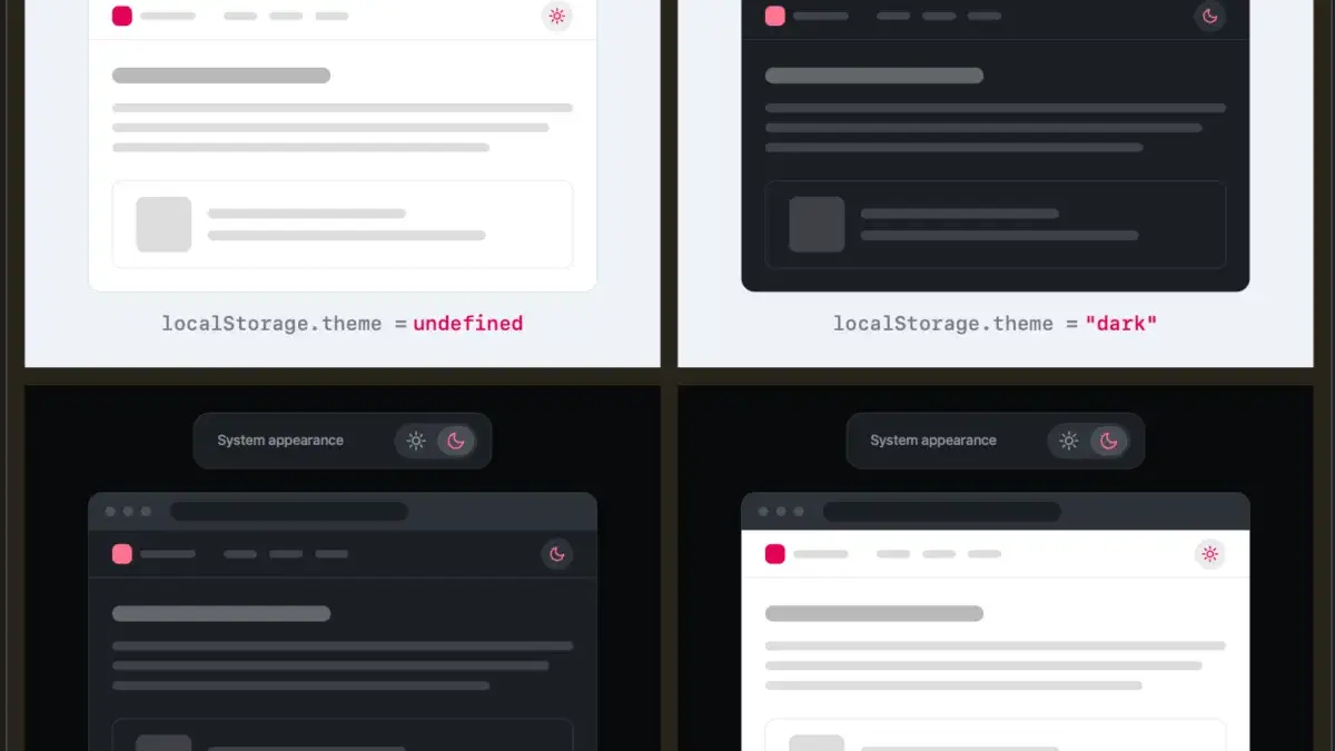
The core of Verou’s argument rests on the natural behavior of operating systems and modern browsers. When a user visits a website for the first time, the page should ideally default to matching the system preference set by the visitor’s operating system. If the user wishes to change this behavior, a good two-state control can effectively manage all three logical outcomes without cluttering the interface. Under this model, if a user has no active preference, the site falls back to system settings. If the user prefers an override, they can click the toggle, and that preference is subsequently stored in the browser’s localStorage for future sessions.
This minimalist approach leads to an even more refined UX question: do web developers even need to display two states when the active color scheme is already apparent? Verou’s line of reasoning suggests that less user interface is generally better, provided it accomplishes the same goals as a more complex control. Removing unnecessary visual elements helps reduce cognitive load for visitors, whose primary focus is typically reading content or navigating the site, rather than fiddling with aesthetic preferences.
The discussion also opens up nuanced technical questions about user intent and state persistence. For instance, consider a scenario where a user starts with a light system preference, manually toggles the site to dark mode, and later decides to switch it back. Does this action generate a new override preference, or does it revert the site back to following the system setting, effectively clearing the localStorage value? Verou suggests that such edge cases might not matter much in practice because theme switching is rarely the primary user intent when visiting a website.
As Verou points out, theme controls are entirely tangential to what a user actually came to accomplish on a page. Even if a user’s intent were to permanently pin a site to a light color scheme rather than reverting to a dynamic system setting that follows the operating system, they would only notice a divergence when the OS shifts to dark mode. At that precise moment, fixing the preference is a single click away—an interaction so frictionless that it hardly warrants continuous space in a permanent navigation bar.
To be precise, Verou’s critique is aimed specifically at persistent UI elements. The guidance targets toggles that remain constantly visible to the visitor, a pattern that is exceedingly common in website headers and navigation menus. When a persistent, multi-option toggle sits prominently at the top of a page, it can inadvertently distract from the visitor’s primary objective and introduce unnecessary cognitive friction.
The discussion has naturally resonated with other developers and designers pondering the broader implications of tying web content to operating system settings. In a related thread on the decentralized social network Bluesky, designer Chris Coleman highlighted a deeper frustration with how the modern web handles these preferences. Coleman noted that many users simply want their underlying operating system to run in a dark mode without forcing every individual website they visit to conform to that exact same aesthetic standard, suggesting that granular light and dark preferences might ultimately belong inside browser settings rather than being managed by individual sites.
While Verou’s primary recommendation favors simplicity and the elimination of clutter, she does acknowledge specific scenarios where a tri-state control remains appropriate. However, for the vast majority of standard websites utilizing persistent navigation toggles, her two-state pattern offers a cleaner, less intrusive alternative.
Following the widespread discussion stirred up by her initial post, Verou published a follow-up summary addressing community feedback and refining her core points. Ultimately, the guidance serves as a reminder to web creators to evaluate whether every interactive element in a navigation bar truly serves the visitor’s primary goals, or whether stepping back and letting the system default do the work yields a superior user experience.


Leave a Reply