As the development community transitions into a new season, the latest edition of the industry roundup series, "What’s !important (#18)," has arrived to highlight the most compelling content, tools, and discussions produced by CSS developers over the preceding weeks. From advanced user interface patterns to groundbreaking browser features and emerging proposals, the recent cycle offers a deep look into the evolving capabilities of modern web development.
Rethinking Tooltips: Delayed Yet Instant
The conversation around user interface micro-interactions frequently centers on polish and intent. In a recent exploration, Abhishek Jakhar tackled a common friction point in web design: why tooltips should feature an intentional delay followed by an instant transition. The rationale is rooted in user experience, ensuring that tooltips are not triggered accidentally as a cursor moves across a page, yet vanish immediately once the user’s interest has passed. Abhishek demonstrated practical implementations to achieve this nuanced behavior.
However, this pattern comes with its own edge cases. If the hoverable region is too small, the tooltip can be de-triggered unintentionally, a scenario where maintaining a baseline delay remains crucial. Building on this discussion, Chris Coyier proposed a modern implementation utilizing interest invokers. This approach relies on two specific CSS properties, interest-delay-start and interest-delay-end. While browser support for interest invokers is currently limited to Chrome, the technique serves as a prime example of progressive enhancement in action, allowing developers to adopt forward-looking patterns safely.
The <geolocation> Element and Its Integration Today
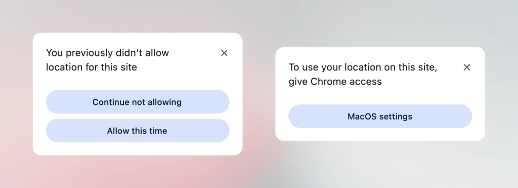
Progressive enhancement remains a central theme in modern web architecture, extending well beyond styling and into native browser capabilities. The Geolocation API has historically presented implementation challenges due to its reliance on complex external hardware sources, including GPS satellites, Wi-Fi networks, and cellular infrastructure. Furthermore, managing and altering user permission states down the line has long been a source of frustration for developers.
The introduction of the new <geolocation> element aims to resolve many of these architectural hurdles, though it simultaneously introduces distinct quirks, such as unique styling restrictions. Because widespread cross-browser support is still developing—with implementation currently limited to Chrome—developers are tasked with finding ways to integrate the new element alongside legacy approaches. Analysts have outlined methods for utilizing <geolocation> safely alongside the existing Geolocation API, enabling development teams to experiment with and deploy the feature today through thoughtful progressive enhancement strategies.
MicroLighter: Bringing the Custom Highlight API to Syntax Highlighting
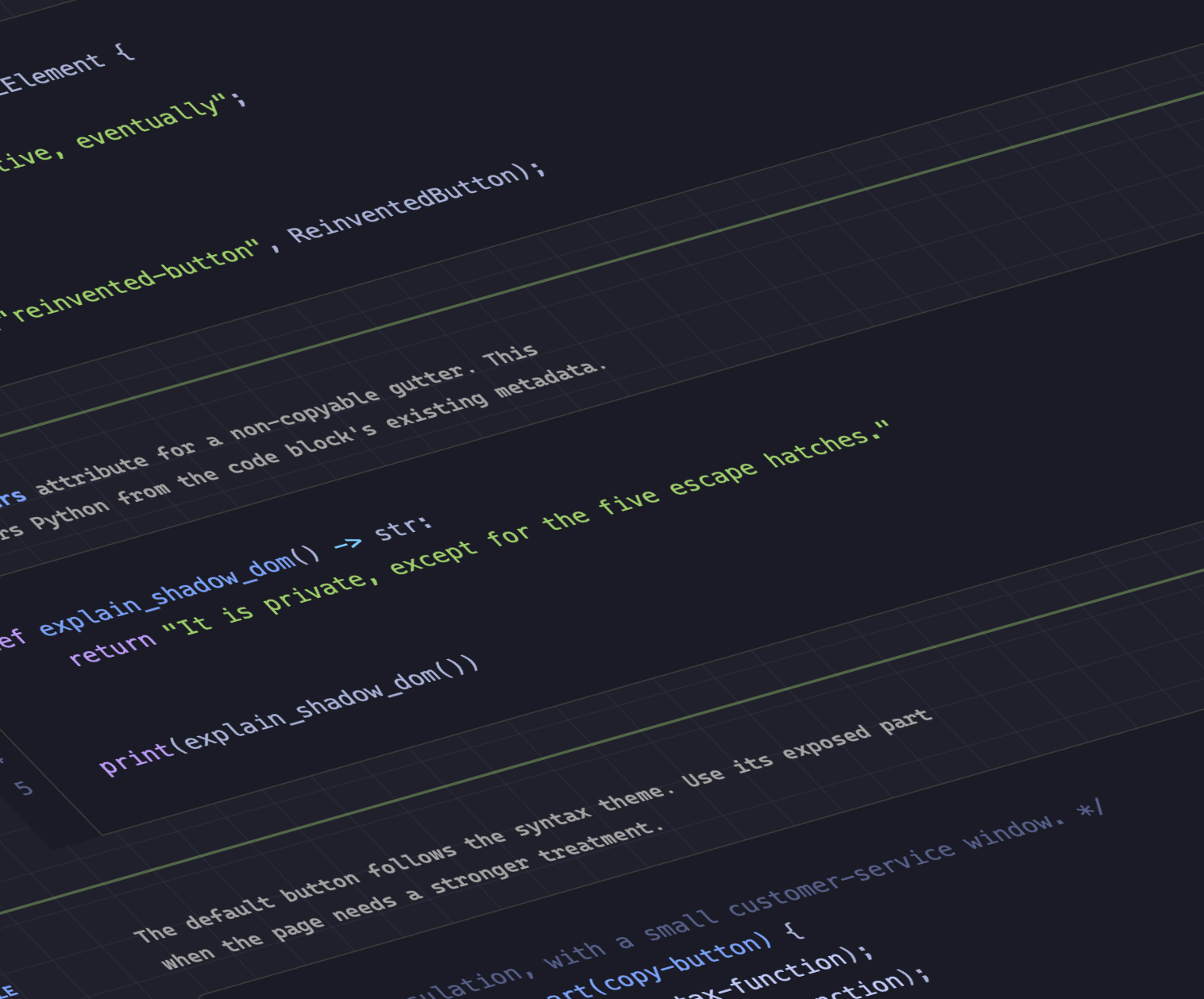
The ongoing expansion of browser styling primitives continues to inspire creative tooling from the developer community. Dave Rupert recently introduced MicroLighter, a lightweight syntax highlighter built upon the emerging Custom Highlight API and its foundational ::highlight() function. Alongside the release of the tool, technical breakdowns have detailed how developers can leverage the Custom Highlight API for high-performance syntax coloring without the heavy DOM manipulation overhead traditionally associated with client-side highlighters. Industry commentators have widely discussed the implications of this approach for text styling and document reading experiences across the modern web.
Extracting CSS Grid Layout Data into Custom Properties
Bridging the gap between layout structures and custom properties has long been a sought-after capability for layout engineers. Temani Afif recently demonstrated a technique for transferring CSS grid information directly into CSS custom properties. This method allows developers to capture the exact number of rows and columns within a grid container, as well as the specific x and y coordinate indexes of individual cells.
While the current technique requires columns to have equal widths, the rapid evolution of layout specifications suggests that such constraints may soon loosen. Temani further illustrated the practical power of this data transfer by applying it to hover proximity calculations, opening up sophisticated interaction design possibilities that were previously difficult to achieve without JavaScript overhead.
Dark Mode Toggles: Two-State or Tri-State Preferences?
User preference management for dark and light color schemes continues to be a subject of architectural debate among frontend designers and accessibility advocates. The discussion has centered on whether user interfaces should rely on a binary two-state toggle or an expanded tri-state control. Perspectives across the community vary, with some advocates arguing for streamlined two-state interactions, while others make a compelling case for tri-state toggles that explicitly separate system inheritance from manual user overrides. Alternative frameworks, such as an auto-until-overridden two-state approach, have also gained traction as a balanced middle ground that respects user intent without cluttering the interface.
The Class Prefix Selector and Future CSS Selectors
As CSS continues to mature, proposals for streamlining everyday selector patterns frequently capture the attention of the community. Bramus recently introduced the concept of the class prefix selector, a straightforward yet powerful syntax proposal designed to simplify how multiple classes are targeted. Although the feature lacks native browser support at present, its intuitive design has led many developers to anticipate rapid adoption once standardization discussions progress.
The proposed selector offers a cleaner and potentially more performant alternative to existing attribute-based selection methods. Historically, matching multiple classes or prefixes required complex attribute selectors that evaluated string matching rules across class attribute strings. The introduction of a dedicated prefix syntax promises to simplify stylesheet maintenance and improve selector efficiency across large codebases.
In tandem with the class prefix selector, recent platform updates have also brought forward new capabilities for feature detection. The introduction of the @supports named-feature() function expands the scope of conditional CSS rules. While currently supported in Chrome, this feature query mechanism is designed to evaluate highly specific browser capabilities that were previously undetectable, such as whether a rendering engine respects CSS transforms when calculating anchor positioning elements. This expansion represents a broader industry push to make feature queries more comprehensive and reliable.
Balancing Wrapped Flex Items Across Layouts
Layout refinement has also seen updates in modern browser engines, particularly regarding how content distributes across multiple lines. A notable addition to Chrome is the introduction of flex-wrap: balance, a feature that draws conceptual inspiration from the text-balancing capabilities of text-wrap: balance, but applies the logic directly to flex container items. Industry experts have analyzed the mechanics of flex-wrap: balance, outlining how developers can utilize the property to achieve more visually harmonious layouts when flex items wrap across multiple rows or columns, reducing awkward ragged edges in responsive user interfaces.
As the industry moves forward into the cooler months, the steady stream of specification proposals, browser implementations, and community-driven utilities highlights an active period of innovation across the web platform.