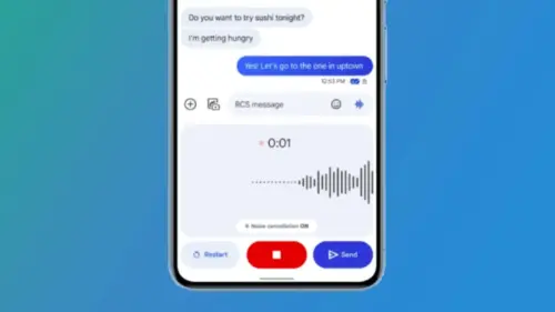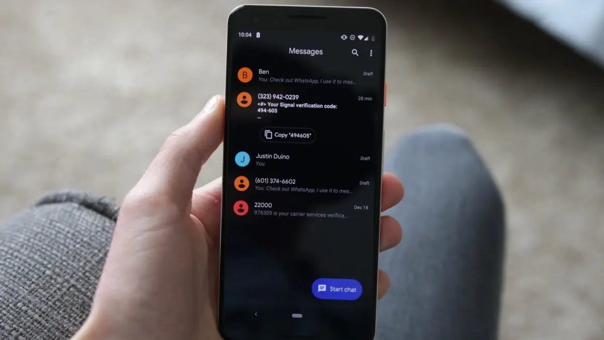
Google is currently rolling out a notable interface update for its popular Google Messages application, bringing significant visual changes to how users interact with their pinned conversations and search functions. The experimental design, which is making its way to select beta testers, introduces a more prominent, visually driven layout for favorite chats that bears a striking resemblance to Apple’s iMessage aesthetic. However, the early rollout has sparked a mix of enthusiasm and criticism among users regarding usability, screen real estate, and navigation efficiency.
The changes were first brought to light by eagle-eyed users across online communities like Reddit, who shared screenshots and initial impressions of the modified layout. Under the new system, pinned conversations are no longer presented in the traditional format featuring smaller entries alongside large contact pictures. Instead, Google has allocated a dedicated, expanded space at the very top of the home screen exclusively for pinned chats. This redesign emphasizes larger contact avatars, transforming the top section of the messaging application into a more graphic and prominent showcase for a user’s most frequently accessed contacts.
While the aesthetic refresh gives the application a cleaner and more spacious overall look, it has immediately raised practical concerns among long-time users who prioritize speed and efficiency in their messaging workflows.
The Trade-Off: Enhanced Visuals Versus Reduced Screen Space
The core debate surrounding the new Google Messages beta centers on the physical layout of the home screen and how the redesigned elements impact day-to-day navigation. By dedicating a prominent, upper section of the display to larger contact photos and expanded pinned chat modules, the application naturally shifts recent, unpinned conversations further down the screen.
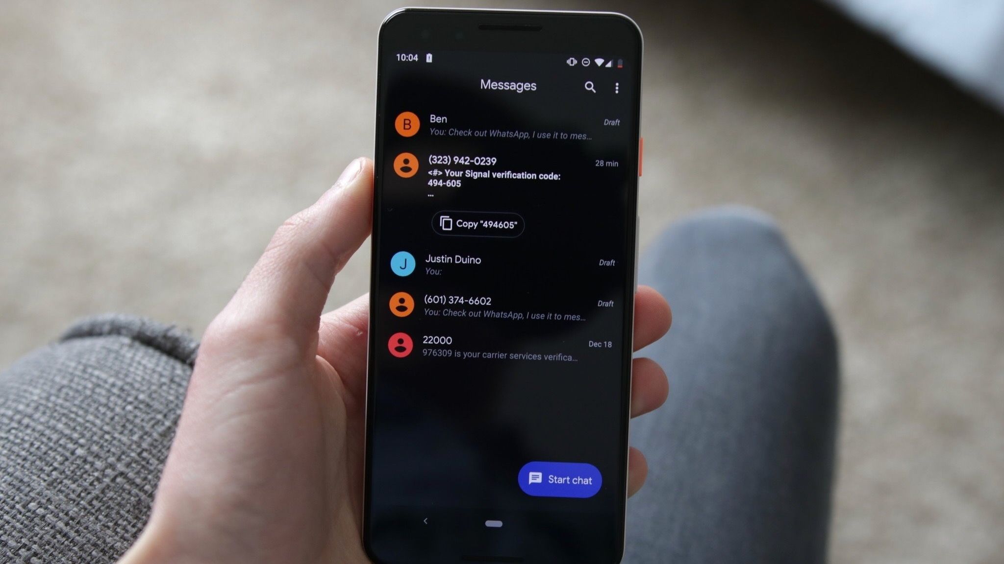
For users who manage a high volume of active message threads, this shift means that reaching unpinned conversations now requires additional scrolling. While supporters of the redesign argue that the larger contact photos make favorite chats much easier to spot at a glance and deliver a more modern overall appearance, detractors contend that the iOS-inspired layout clutters the top of the interface. Critics argue that forcing users to scroll past enlarged elements to access standard messages introduces friction into an app that previously relied on a compact, dense list format for maximum information density.
Furthermore, early beta testers have highlighted minor design quirks associated with the new layout. Some users reported encountering an awkward empty placeholder space when only a couple of conversations are actively pinned. According to feedback shared within the community, this empty visual space tends to disappear once a user populates the area with additional pinned chats, with early indicators suggesting the maximum pin limit may hover around six conversations. This behavior has led to additional discussions about how the interface scales dynamically depending on individual user habits and the number of active pinned threads.
Reimagining Search and Floating Action Controls
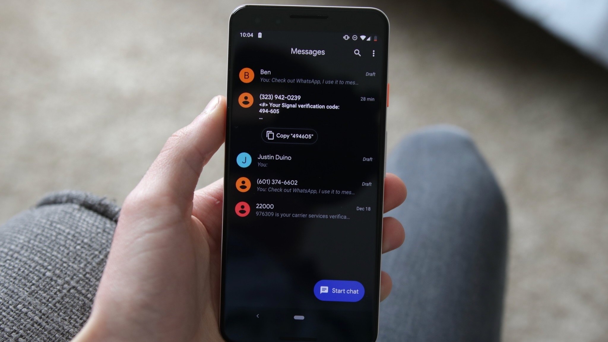
In addition to overhauling the pinned conversation section, Google is actively experimenting with a secondary, yet equally significant, redesign concerning how search functionality is integrated into the application. In the current experimental build, the traditional search bar location has been altered, with Google opting instead to introduce a floating action button positioned directly next to the "Start chat" button.
Depending on the user’s scroll position within the message list, this floating element dynamically alternates between a circular magnifying glass and a pill-shaped search button. This departure from conventional static header search bars represents another step toward a more fluid, floating-action-oriented design language across Google’s mobile ecosystem. However, the experimental nature of the rollout means that other high-profile integrations, such as the exact placement and final behavior of the Gemini shortcut, remain somewhat unclear as developers continue to test different configurations in the wild.
Patchy Rollout and Beta Feedback
True to Google’s typical deployment strategy, the distribution of this new user interface has been notably uneven. Testers running the beta version of Google Messages (specifically version 20261030_00_RC00) have reported vastly different experiences; some have received the visual overhaul immediately, while others running the exact same application version continue to see the legacy interface. Reports from users indicate that these interface elements are being activated via server-side switches rather than through traditional Google Play Store application updates, allowing the development team to toggle and adjust features on the fly.
Beyond the major layout structural changes, early testers have also pointed out minor operational friction, including occasional choppy animations during scrolling and transitions, as well as slight variations in how the interface renders across different device models and screen sizes. For instance, some users spotted the new features appearing automatically on hardware like the Pixel 9 Pro without requiring any manual intervention or secondary downloads.
As Google continues to gather feedback from the beta testing community, no official timeline or stable release date has been announced for a wider public rollout. While many users appreciate the effort to modernize the interface and provide greater visual distinction for important contacts, calls are growing for Google to introduce customizable options—such as a toggle to switch between compact and expanded pinned chat views. Ultimately, the challenge for developers lies in balancing a sleek, modern aesthetic with the rapid, frictionless communication that users expect from a primary daily messaging application.