
As the web development community moves into a new season of design and engineering updates, the latest edition of What’s !important brings together a comprehensive look at the most significant discussions, tools, and proposed specifications from across the CSS ecosystem. Over the past couple of weeks, developers and specification authors have introduced innovative approaches to long-standing user experience challenges, from the behavioral nuances of interactive UI elements to experimental new selectors and APIs designed to make styling more powerful and performant.
Rethinking Tooltips with Delays and Instant Dismissal
One of the prominent discussions centers around user interface feedback and micro-interactions, specifically how tooltips behave under various user conditions. Abhishek Jakhar recently published an exploration into why tooltips require a carefully balanced interaction model: they need a brief delay before appearing to prevent accidental triggers, but once dismissed or moved away from, they should disappear immediately to avoid lingering visual clutter. Jakhar demonstrated how developers can implement this behavior using existing techniques. However, careful consideration remains necessary, particularly regarding hoverable regions. If the interactive area is too small, users can unintentionally de-trigger the tooltip, making a considered delay crucial for usability.
Building upon this concept, Chris Coyier responded with a modern implementation leveraging interest invokers, an emerging web platform capability governed by two specific CSS properties: interest-delay-start and interest-delay-end. While current implementation support for interest invokers is largely limited to Chrome, the technique provides a strong foundation for progressive enhancement, allowing modern browsers to adopt native interest-based timing while older environments fall back gracefully.
The <geolocation> Element and Its Integration Today
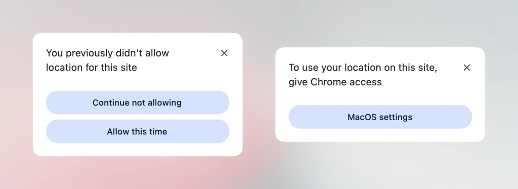
Progressive enhancement remains a central theme with the arrival of discussions surrounding the <geolocation> element. Historically, working with the Geolocation API has introduced structural friction due to its reliance on external hardware like GPS satellites, Wi-Fi triangulation, and cellular networks, combined with the often frustrating user experience of altering permission statuses after an initial choice.
The proposed <geolocation> element aims to resolve many of these architectural hurdles, though it introduces its own set of unique characteristics, including specific styling restrictions. Because browser support for the new element is currently confined to Chrome, developers are looking at hybrid approaches. By utilizing the new HTML element alongside the established JavaScript Geolocation API, engineering teams can deploy the feature in supporting browsers today while maintaining full functionality across the broader web ecosystem.
MicroLighter: A Syntax Highlighter Built on the Custom Highlight API
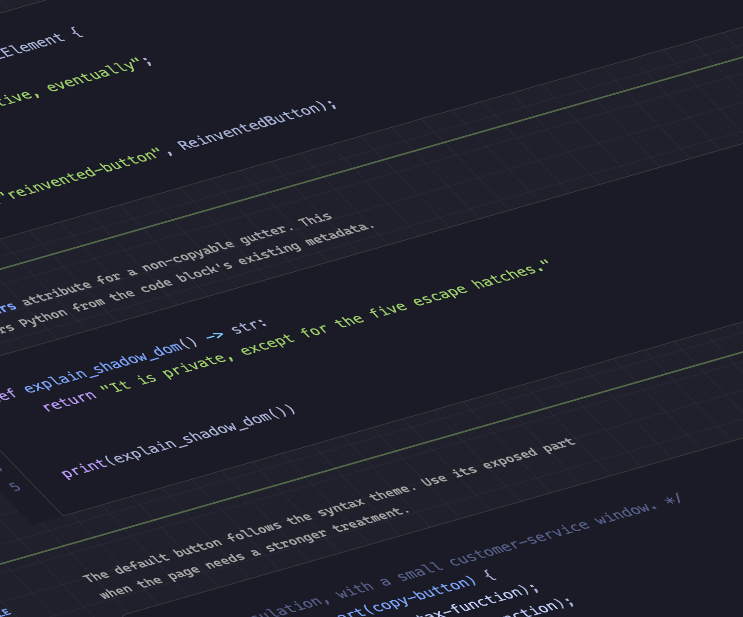
In the realm of typography and syntax presentation, Dave Rupert has introduced MicroLighter, a lightweight syntax highlighter built upon the modern Custom Highlight API and the ::highlight() pseudo-element. Rupert detailed the construction and implementation of the tool, while Geoff and other community commentators have highlighted its efficiency compared to traditional DOM-heavy highlighting methods. By utilizing native browser highlighting primitives rather than wrapping every token in separate span elements, MicroLighter showcases the performance benefits of leveraging modern web platform APIs for text styling.
Extracting CSS Grid Information into Custom Properties
Layout control took another significant step forward as Temani Afif demonstrated a technique for transferring CSS grid layout information directly into CSS custom properties. This method allows developers to dynamically access the number of rows and columns within a grid container, as well as the exact x and y index coordinates of individual grid cells. While the technique currently requires columns to have equal widths, the ongoing evolution of CSS suggests that such constraints may loosen over time.
Afif further illustrated the practical applications of this data transfer by using grid coordinates to calculate hover proximity in modern CSS layouts, opening up sophisticated interaction design patterns that previously required complex JavaScript calculations.
The Ongoing Debate Over Dark Mode Toggle States
User preference management continues to spark architectural debates among frontend developers, particularly regarding dark mode implementations. Lea Verou has made the case for a traditional two-state toggle approach, while Bramus advocates for a tri-state model that accounts for system preferences, explicit light mode, and explicit dark mode. Meanwhile, alternative perspectives, such as the auto-until-overridden two-state approach described by Vale.Rocks, suggest that balancing automated user preferences with explicit overrides offers an optimal middle ground for modern web applications.
Anticipating the CSS Class Prefix Selector
Bramus also brought attention to a proposed addition to the CSS specification: the class prefix selector. Although support for the selector is not yet available in any major browser engine, its potential utility has generated considerable interest. The syntax is designed to simplify how developers target multiple classes sharing a common prefix.
Instead of relying on attribute selectors, which can introduce performance overhead and verbose syntax when matching classes beginning with specific strings or containing hyphenated patterns, the proposed class prefix selector provides a cleaner, more performant native alternative. Geoff and other industry observers have analyzed the proposal, anticipating rapid adoption and implementation once browser vendors begin working on specs.
Feature Detection with @supports named-feature()
Expanding the capabilities of conditional styling, Bramus introduced the @supports named-feature() function, which is currently supported in Chrome. This function addresses a long-standing limitation in CSS feature detection by allowing developers to query highly specific browser behaviors and implementation details that were previously impossible to test via traditional @supports queries. Examples include checking whether a browser correctly respects CSS transforms when applied to anchor-positioned elements. The feature aims to make conditional styling more robust and reliable as complex layout engines continue to evolve.
Balancing Flexbox Layouts with flex-wrap: balance
Layout flexibility received another update with the introduction of flex-wrap: balance in Chrome. Functionally similar to text-wrap: balance for typography, this new property value aims to distribute wrapped flex items more evenly across rows or columns, preventing awkward single-item wrapping scenarios. Ahmad Shadeed published an in-depth analysis of how flex-wrap: balance operates and how developers can integrate it into modern responsive design workflows to improve visual rhythm across varying viewport sizes.
As the web development ecosystem transitions into the autumn season, these discussions and specification proposals highlight an ongoing industry-wide focus on performance, developer ergonomics, and reducing reliance on complex JavaScript workarounds for native UI behaviors.



Leave a Reply