The web development landscape continues to evolve at a relentless pace, bringing forth a fresh wave of features, APIs, and theoretical concepts designed to make building user interfaces more intuitive and performant. In the latest edition of the developer-focused round-up series, industry experts have once again curated the most compelling discussions, code snippets, and architectural techniques produced by the CSS and frontend community over the past couple of weeks. From smarter tooltip interactions and experimental HTML elements to grid-based variable mapping and advanced dark mode philosophies, the frontend ecosystem is pushing the boundaries of what native browsers can achieve without heavy JavaScript dependencies.
Refining User Experience: Delayed and Instant Tooltips
One of the foundational challenges in interface design is managing user attention without causing frustration. Abhishek Jakhar recently explored a nuanced approach to tooltip behavior, arguing that tooltips should ideally feature a delayed trigger followed by an instant disappearance. By introducing a delay before a tooltip appears, developers can prevent accidental triggers when a user’s cursor merely sweeps across the screen. Conversely, once the user no longer wants or needs the information, the tooltip should vanish immediately to clear the visual clutter.
While Jakhar provided practical implementation strategies for this behavior, he also highlighted a potential caveat: if the hoverable region associated with the tooltip is too small, the user can inadvertently de-trigger the element, making the interaction feel jittery. Consequently, maintaining a calculated delay remains crucial in specific spatial contexts.
Expanding on this concept, Chris Coyier demonstrated a modern implementation leveraging newly emerging interest invokers. These rely on native CSS properties such as interest-delay-start and interest-delay-end to handle the timing mechanisms natively. Although current support for interest invokers is largely confined to Chrome environments, the approach serves as a prime example of progressive enhancement in action, allowing developers to build future-proof interfaces that degrade gracefully in unsupported browsers.
Navigating the <geolocation> Element and Its Integration Today
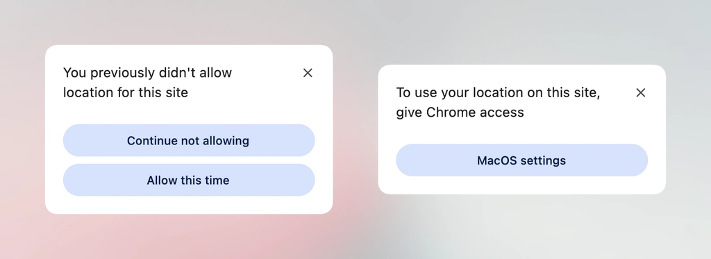
Progressive enhancement remains a central theme as new native web components enter the testing grounds. The traditional Geolocation API has historically presented a steep learning curve and integration headache due to its reliance on external hardware—including GPS satellites, Wi-Fi triangulation, and cellular towers—coupled with the friction of managing user permission states over time.
The introduction of the experimental <geolocation> HTML element aims to streamline much of this complexity, though it naturally introduces a new set of quirks, including distinct styling restrictions. Because support is currently limited primarily to Chrome, developers face the immediate challenge of bridging the gap between legacy practices and emerging standards. Industry analysis has outlined strategies for utilizing the <geolocation> element alongside the established Geolocation API, ensuring that production applications can adopt the new syntax today while maintaining broad compatibility across the wider browser landscape.
MicroLighter: A Lightweight Syntax Highlighter Powered by the Custom Highlight API
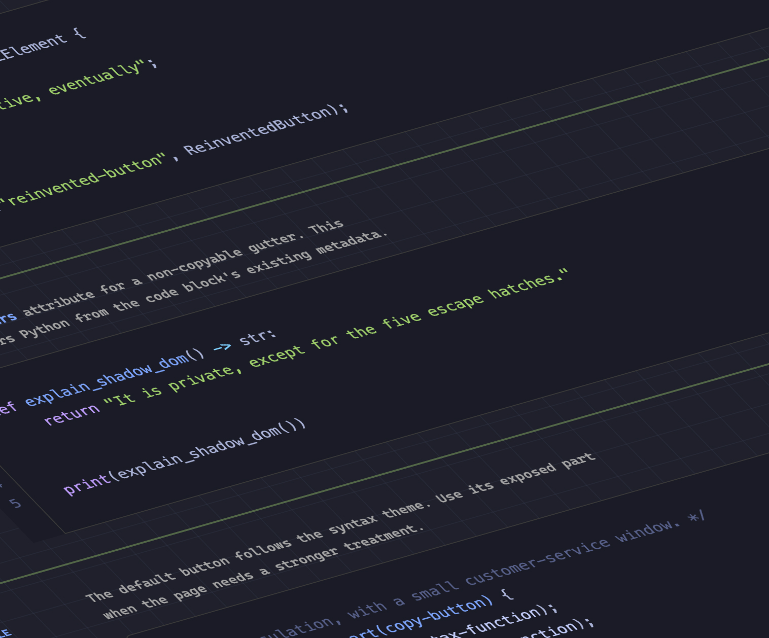
Syntax highlighting has traditionally required heavy JavaScript parsing libraries to tokenize code blocks and inject spans with various class names. Dave Rupert challenged this paradigm by introducing MicroLighter, a remarkably compact syntax highlighter built directly on top of the modern Custom Highlight API. By utilizing the ::highlight() pseudo-element, MicroLighter operates with significantly reduced overhead. Rupert detailed the engineering philosophy and usage patterns behind the tool, sparking broader industry conversations led by figures like Geoff regarding the viability of browser-native text highlighting for performance-critical applications.
Bridging CSS Grid Information and Custom Properties
The relationship between layout engines and styling variables has grown increasingly intimate, thanks to exploratory work by developers like Temani Afif. Afif recently demonstrated a technique for passing CSS grid layout information directly into CSS custom properties. This capability allows developers to capture the exact number of rows and columns, as well as the specific x and y coordinate indexes of individual grid cells, provided the columns maintain equal widths.
The practical applications of this data bridge extend far beyond static layout design. Afif illustrated how capturing grid coordinates dynamically can be harnessed to calculate hover proximity, unlocking sophisticated interaction states based entirely on spatial relationships within a CSS grid. As layout specifications continue to mature, the boundary between structural layout metrics and dynamic styling continues to blur.
The Ongoing Debate Over Dark Mode Architectures
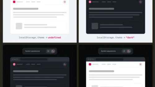
As dark mode implementation becomes a standard requirement for modern web applications, architectural debates persist regarding how user preferences should be managed. The discussion largely centers on whether developers should rely on a traditional two-state toggle—switching explicitly between light and dark modes—or adopt a tri-state approach that includes an explicit system-matching preference.
Lea Verou has advocated for the simplicity of a two-state configuration, whereas Bramus has made a compelling case for the flexibility of tri-state toggles. Meanwhile, alternative perspectives, such as the auto-until-overridden two-state approach highlighted by Vale.Rocks, suggest a middle ground where the interface automatically mirrors system settings until the user manually intervenes. These differing philosophies highlight the lack of a universal standard for state management in theme switching, leaving developers to weigh user autonomy against interface complexity.
Simplifying Selectors with the Class Prefix Selector
Bramus also introduced the concept of the class prefix selector, a proposed syntax designed to streamline how developers target groups of classes sharing a common naming convention. While the feature lacks native browser support at present, its elegant syntax—denoted by patterns such as targeting prefixes with an asterisk—has generated considerable anticipation for a rapid development lifecycle.
In practice, this proposed selector offers a cleaner and significantly more performant alternative to traditional attribute selectors like those searching for classes starting with or containing specific substrings. Where attribute selectors force the rendering engine to evaluate string patterns across complex DOM trees, a dedicated class prefix selector promises optimized evaluation, drawing supportive commentary from across the frontend community.
Feature Detecting with @supports named-feature()
In a similar vein of extending native tooling, the introduction of the @supports named-feature() function offers a granular approach to capability detection. Supported within Chrome, this function allows developers to query highly specific browser behaviors that were previously impossible to isolate through standard feature detection. For instance, developers can verify whether a browser respects specific transform behaviors when handling anchor positioning elements. This addition aims to expand the overall capability of the @supports rule, giving engineers finer control over progressive enhancement strategies for complex layout interactions.
Balancing Wrapped Flex Items Across Layouts
Rounding out the layout enhancements arriving in modern browsers is the introduction of flex-wrap: balance. Much like its textual counterpart text-wrap: balance, which automatically distributes text lines evenly to prevent awkward ragged endings, this new flexbox property evaluates wrapped flex items and balances their distribution across rows or columns. Ahmad Shadeed explored the mechanics of flex-wrap: balance, illustrating how developers can leverage the feature to create more aesthetically balanced and predictable multi-item layouts without resorting to complex calculation scripts.
As autumn arrives and the web platform absorbs these diverse architectural advancements, the ongoing dialogue among CSS developers underscores a collective push toward native efficiency, reduced JavaScript reliance, and more expressive styling tools.