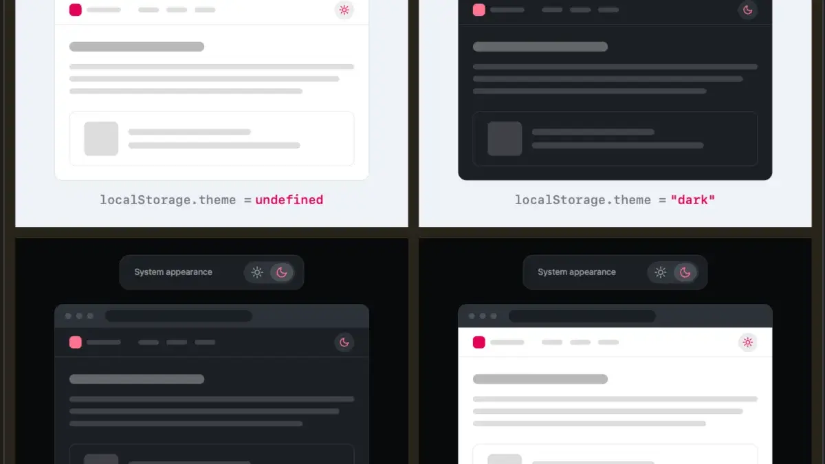
The eternal debate over how websites handle user color scheme preferences has sparked fresh discussion across the web development community, following a provocative critique by prominent developer and UI/UX researcher Lea Verou. For years, digital designers and front-end engineers have defaulted to a standard pattern when implementing light and dark mode toggles: a tri-state control offering visitors the choice between "Light," "Dark," and "System" settings.
However, Verou is pushing back hard against this convention, arguing that displaying a persistent three-state option in a website’s navigation or header is fundamentally unnecessary. According to Verou, a well-designed two-state control is more than capable of expressing all three necessary operational states without cluttering the interface or introducing avoidable cognitive friction for the user. Her core thesis is deceptively simple: websites should gracefully fall back to the visitor’s underlying operating system preferences by default, while providing a straightforward, single-action override only when a user explicitly wants to break from that system setting. Once triggered, that specific preference can be securely stored in the browser’s local storage for future sessions.
The underlying mechanics of this approach reduce visual clutter significantly. When a user arrives at a website with no prior history or stored preference, the page simply honors the system-level color scheme. If the user wishes to change it, a simple two-state toggle—often represented by a sun or moon icon—allows them to flip the theme. Proponents of this methodology argue that anything more complicated forces users to parse redundant information. In fact, some design thinkers suggest that when the active color scheme is already visually apparent, even a standard two-state toggle can sometimes be minimized or re-evaluated depending on how critical the theme-switching functionality is to the core user experience.
This minimalist design philosophy raises interesting technical questions about state management and user intent, particularly regarding edge cases. For instance, consider a scenario where a user starts with a light system preference, manually overrides the website to a dark theme, and later toggles it back to light. Does that action generate a new explicit override preference, or does it cleanly revert the browser to follow the system setting by clearing the local storage value?
Ultimately, Verou suggests that these microscopic edge cases may not actually matter in the grand scheme of web browsing because theme switching is rarely, if ever, a visitor’s primary goal when landing on a page. The theme toggle is an entirely tangential control relative to why a user is visiting a specific piece of content or utilizing a service. Even if a user’s intent were to permanently pin a light theme rather than simply reverting to a system-controlled light state, the divergence between the operating system and the website would only become noticeable when the OS naturally shifts into dark mode later in the day. At that exact moment, fixing the preference is a single, frictionless click away—so trivial that there is little value in front-loading complex UI controls to prevent it.

To be entirely clear, this UX critique specifically targets persistent UI elements—those permanent toggles that sit stubbornly in a site’s header, footer, or navigation bar across every page view. Because these navigational elements are ever-present, they risk distracting visitors from their primary intent. The more options a persistent menu item displays, the more cognitive dissonance it introduces to the user experience. By streamlining these controls down to the bare essentials, developers can maintain clean, accessible interfaces without sacrificing user choice.
The discussion has also reignited broader conversations about how web browsers handle system-level styling versus individual site preferences. As developer Chris Coleman noted in related thread discussions, many users simply want their operating system or specific desktop environment to run in dark mode for productivity or aesthetic reasons, without necessarily wanting every single web page they visit to automatically adopt a high-contrast dark theme. Coleman pointed out that tying all web content directly to system preferences was a massive leap by browser vendors years ago, and suggested that more granular color scheme controls would ideally live natively within the browser settings rather than requiring every individual publisher to build custom UI chrome into their navigation bars.
Despite her sweeping critique of standard tri-state buttons, Verou acknowledges that three-state controls are not entirely obsolete. There remain specific use cases where offering explicit light, dark, and system options is appropriate and necessary. These exceptions generally occur when the control governs a deeply integrated application interface where color mode is a primary functional requirement of the workspace, or when dealing with complex enterprise software environments where user preferences must override erratic system behaviors across multi-window workflows.
The debate has continued to evolve as the web development community reacts to the nuances of persistent UI design. Whether developers choose to completely eliminate the traditional system toggle or simply refine their existing navigation bars, the conversation highlights a growing desire to reduce interface bloat and respect user attention. As Verou and her followers have emphasized, the best interface is often the one that gets out of the way entirely, letting system defaults and intelligent fallbacks do the heavy lifting while keeping manual overrides effortless and understated.