
The web development landscape continues to evolve at a rapid pace, bringing forth innovative approaches to longstanding user interface challenges, experimental browser features, and refined specifications. The latest edition of the web development community’s recurring roundup highlights a diverse array of breakthroughs produced by CSS developers and platform engineers over recent weeks. From advanced tooltip mechanics and native HTML geolocation elements to cutting-edge syntax highlighters and experimental CSS selectors, the front-end ecosystem is seeing a wave of creative problem-solving aimed at improving performance, user experience, and developer ergonomics.
Refining User Experience with Delayed and Instant Tooltips
User interface polish often lies in the details, and tooltips have long been a subtle pain point for designers and developers. Abhishek Jakhar recently addressed this issue by exploring why tooltips should ideally feature a delayed appearance followed by an instant dismissal. By implementing a delay before a tooltip triggers, developers can prevent accidental activations when a user’s cursor sweeps rapidly across a page. Conversely, once the user is finished with the information, making the tooltip disappear immediately ensures the interface feels responsive and uncluttered.
While Jakhar demonstrated how to build this behavior using conventional methods, he noted that small hoverable regions can occasionally cause tooltips to de-trigger unintentionally, making a controlled delay valuable in specific contexts. Building upon this discussion, Chris Coyier proposed a modern implementation utilizing interest invokers. This approach leverages two key CSS properties: interest-delay-start and interest-delay-end. Although browser support for interest invokers is currently limited to Chrome, the technique serves as a prime example of progressive enhancement in action, allowing modern browsers to adopt native solutions while fallback mechanisms handle the rest.
Navigating the New <geolocation> Element
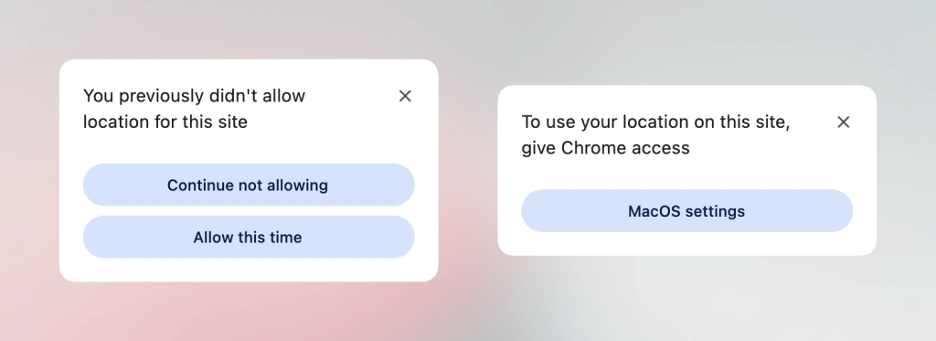
Progressive enhancement remains a central theme in web platform updates, particularly with the introduction of the <geolocation> element. Historically, working with the Geolocation API has been notoriously complex due to its reliance on external hardware components such as GPS satellites, Wi-Fi networks, and cellular towers. Furthermore, managing and altering permission statuses after an initial prompt has often proved frustrating for both developers and end users.
The new <geolocation> element aims to streamline much of this complexity, though it introduces a few unique quirks of its own, including specific styling restrictions. Because support for this element is currently exclusive to Chrome, developers must adopt integration strategies that pair <geolocation> with the existing Geolocation API. This hybrid approach enables modern utilization today, bridging the gap between emerging HTML standards and cross-browser compatibility.
MicroLighter and the Evolution of Syntax Highlighting
Syntax highlighting on the web is also undergoing a architectural shift, driven by modern browser capabilities. Dave Rupert recently introduced MicroLighter, a lightweight syntax highlighter built upon the newly available Custom Highlight API and the ::highlight() pseudo-element. Unlike traditional highlighters that inject a multitude of span elements into the Document Object Model, the Custom Highlight API allows developers to style ranges of text directly, resulting in cleaner markup and improved performance. Rupert detailed the construction and implementation of MicroLighter, drawing commentary from industry peers regarding the broader implications of highlight-based styling for web typography and code presentation.
Extracting CSS Grid Information into Custom Properties
Layout capabilities within CSS have expanded dramatically over recent years, yet bridging the gap between layout geometry and custom properties has traditionally required JavaScript intervention. Temani Afif recently demonstrated how to extract CSS grid information directly into CSS custom properties. By leveraging modern CSS features, developers can now capture the number of rows and columns within a grid, as well as the specific X and Y coordinate indexes of individual cells.
While this technique currently requires columns to have equal widths, the rapid evolution of the CSS specification suggests such constraints may soon loosen. Afif further illustrated the practical utility of this breakthrough by applying grid coordinate data to determine hover proximity, opening up sophisticated interaction design patterns previously thought to require script-based tracking.
The Ongoing Debate Over Dark Mode Toggle States
As dark mode preferences become a standard expectation across digital products, developers continue to debate the ideal user interface pattern for theme toggling. A divergence in philosophy has emerged among prominent web figures, with Lea Verou advocating for a traditional two-state toggle approach, while Bramus champions the case for a tri-state toggle model. Meanwhile, alternative perspectives such as the auto-until-overridden two-state approach—detailed by Vale.Rocks—offer a nuanced middle ground where the interface respects system settings automatically until the user explicitly intervenes, balancing automated convenience with user control.
Exploring the Class Prefix Selector and Named Features
In the realm of selectors and feature detection, Bramus has introduced several forward-looking proposals. Among them is the class prefix selector, a straightforward syntax designed to target multiple classes efficiently. Although lacking current browser support, the selector offers a cleaner and more performant alternative to traditional attribute selectors. By streamlining how prefixed classes are matched, the proposal addresses common styling patterns found in large-scale design systems and utility-first CSS frameworks.
In addition to the class prefix selector, Bramus highlighted the @supports named-feature() function. Currently supported in Chrome, this function allows developers to query support for very specific browser behaviors and features that were previously undetectable. By enabling granular feature queries—such as whether a browser correctly respects transforms on anchor-positioned elements—the named-feature() function promises to make the @supports rule significantly more versatile for advanced layout engineering.
Balancing Flexbox Layouts
Layout refinement extends beyond grids and custom properties, touching traditional layout models like Flexbox as well. Newly introduced to Chrome, the flex-wrap: balance property brings the concept of wrapping equilibrium—previously popularized by text-wrap: balance in typography—to flex items. Ahmad Shadeed explored the mechanics of this feature, detailing how developers can leverage balanced flex wrapping to distribute items evenly across rows or columns, preventing awkward orphan items and creating visually harmonious user interfaces. As the web platform continues to absorb these seasonal updates, developers are equipped with an increasingly powerful suite of tools to craft resilient, high-performance web experiences.



Leave a Reply