As the web development community transitions into a new seasonal cycle, front-end engineers and CSS developers are greeted with a fresh wave of powerful capabilities, paradigm shifts, and architectural proposals. The latest edition of the industry’s premier design newsletter captures an exceptionally active period for browser evolution, showcasing groundbreaking updates in layout engines, syntax highlighting, native HTML elements, and design tokens. From revolutionary layout balancing techniques to the ongoing debate over user interface state management, the contemporary web platform continues to mature at a rapid pace.
Refining User Experience with Delayed-Then-Instant Tooltips
The intricacies of user interface micro-interactions have long occupied the attention of front-end developers, particularly when it comes to tooltips. In recent discussions, developer Abhishek Jakhar explored a persistent UX challenge: tooltips should ideally feature a deliberate delay before appearing to prevent accidental triggers, yet disappear instantaneously when the user shifts their focus away or no longer requires the context. Jakhar demonstrated comprehensive implementation strategies to achieve this specific temporal behavior using established techniques.
However, edge cases remain a primary concern in UI engineering. Industry observers noted that if a hoverable region is insufficiently sized, a tooltip can easily become de-triggered unintentionally during minor mouse movements. Consequently, maintaining a protective delay under those specific conditions remains a critical consideration for robust interface design.
Building upon these concepts, veteran developer Chris Coyier introduced a modern implementation leveraging native interest invokers. This approach relies on two emerging CSS properties: interest-delay-start and interest-delay-end. While browser implementation of interest invokers is currently limited to Chrome, the technique serves as a textbook example of progressive enhancement, allowing forward-thinking developers to build resilient experiences that gracefully adapt to varying browser support matrices.
The <geolocation> HTML Element and Progressive Enhancement
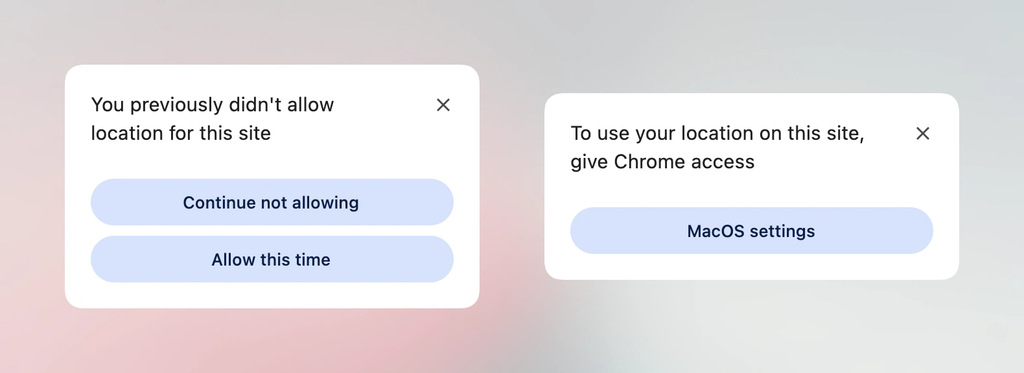
Speaking directly to the philosophy of progressive enhancement, the management of user location data has historically been fraught with complexity. Developers have long had to interface with the complicated JavaScript Geolocation API, which coordinates a myriad of underlying hardware systems including GPS satellites, nearby Wi-Fi networks, and cellular towers. Furthermore, managing shifting permission states and handling subsequent user prompts has consistently frustrated both developers and end-users.
The introduction of the native <geolocation> HTML element aims to alleviate many of these historical friction points, though it introduces a distinct set of modern design quirks, most notably concerning styling restrictions. Because native support is presently confined to Chrome, developers are tasked with bridging the gap between legacy implementations and cutting-edge markup. Industry experts have detailed integration patterns showing how to utilize the <geolocation> element in tandem with the traditional Geolocation API, effectively enabling developers to adopt the new standard today without alienating users on alternative browser platforms.
MicroLighter and the Evolution of Syntax Highlighting
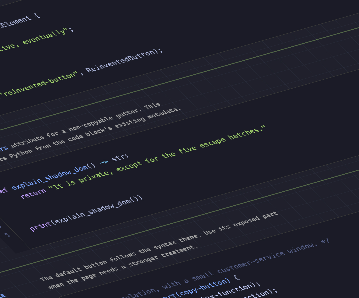
The front-end ecosystem has also seen notable advancements in code presentation and performance through the utilization of native browser capabilities. Developer Dave Rupert recently unveiled MicroLighter, a lightweight syntax highlighter built upon the modern Custom Highlight API and the ::highlight() CSS pseudo-element.
Rather than injecting heavy DOM nodes, span tags, and convoluted markup into the document tree for every single line of code, the Custom Highlight API allows developers to style ranges of text directly via CSS. Rupert detailed the technical implementation of MicroLighter, which has since sparked broader community conversations regarding the performance benefits of moving syntax highlighting away from traditional DOM manipulation and into the realm of native browser rendering layers.
Extracting CSS Grid Information into Custom Properties
Layout architecture received a significant boost with new techniques for bridging the gap between layout engines and styling variables. CSS expert Temani Afif demonstrated a powerful method for capturing CSS grid layout information—specifically the total number of rows and columns, as well as the precise x and y coordinate indexes of individual grid cells—and passing that data directly into CSS custom properties.
While this technique currently requires columns to maintain equal widths, the implications for dynamic styling are profound. Afif illustrated how capturing structural grid metrics can be harnessed to calculate hover proximity directly within modern CSS. This capability opens up sophisticated interface possibilities that previously required heavy JavaScript calculations to monitor cursor position relative to complex grid geometries.
The Ongoing Debate Over Dark Mode State Management
As dark mode implementation becomes a universal standard across digital products, architectural debates regarding user preference toggles continue to divide the developer community. A notable philosophical split has emerged concerning user interface state management for color schemes.
Prominent web standards advocate Lea Verou has made the case for a traditional two-state toggle system, while developer Bramus advocates for a tri-state approach that explicitly separates system preference, light mode, and dark mode. Meanwhile, alternative perspectives advocate for a nuanced auto-until-overridden two-state model. This hybrid philosophy respects the operating system’s global preference by default, but automatically converts to a persistent explicit state the moment a user manually interacts with the site’s theme toggle, balancing automation with user autonomy.
Anticipating the Class Prefix Selector and Named Features
Looking toward the future of style sheet architecture, Bramus introduced the concept of the class prefix selector. Although not yet supported across production browsers, the proposal offers a remarkably clean and performant syntax for targeting multiple classes matching a specific naming convention. By utilizing a dedicated prefix syntax, developers can avoid the performance overhead and verbose syntax associated with traditional attribute selectors such as prefix, suffix, and substring matching selectors. Given its simplicity and utility, industry analysts anticipate strong interest from browser vendors regarding its standardization.
In tandem with the class prefix selector, Bramus highlighted advancements in feature detection with the introduction of the @supports named-feature() function. Currently supported in Chrome, this capability expands the traditional @supports rule beyond basic property-and-value pairs. It allows developers to query highly specific browser behaviors that were previously undetectable, such as whether a rendering engine correctly respects layout transforms when positioning anchored elements, promising a more robust foundation for modern feature detection.
Balancing Wrapped Flex Items Across Layouts
Rounding out the recent wave of layout innovations, Chrome has introduced support for flex-wrap: balance. Much like the popular text-wrap: balance property that revolutionized responsive typography by ensuring even line lengths, the new flex-wrap balancing capability applies a similar typographic sensibility to flex containers.
Layout engineers have long struggled with ragged wrapping in flexbox layouts, where an initial row contains numerous items while a wrapped subsequent row contains only a single stray element. By introducing balancing algorithms to flex wrapping, browsers can now distribute items more evenly across available rows or columns. As autumn arrives and web platforms continue their steady march toward standardization, these developer-focused features collectively signal a future defined by greater layout control, enhanced performance, and cleaner, more maintainable codebases.