
The web development landscape continues its rapid evolution, bringing forth a fresh wave of features, APIs, and design methodologies that promise to reshape how developers build and style modern user interfaces. In the latest compilation of prominent web development discussions, industry experts have turned their attention to everything from refined user experience patterns like delayed tooltips to cutting-edge browser capabilities such as native geolocation integration, custom highlight syntax highlighters, and innovative selector proposals.
As developers adapt to these ongoing changes, the conversation around progressive enhancement remains central. Modern CSS and HTML specifications are increasingly bridging the gap between what developers could previously only achieve with complex JavaScript abstractions and what can now be handled natively by the browser.
Rethinking Tooltip Interactions for Better Usability
User interface patterns that seem trivial on the surface often harbor significant complexity beneath the hood. A prime example is the humble tooltip, an interface element that has traditionally suffered from frustrating interaction models—triggering entirely by accident when a user’s cursor merely sweeps across the screen, yet refusing to vanish promptly when the user’s attention moves elsewhere.
To address this persistent usability hurdle, developer Abhishek Jakhar recently broke down the mechanics of designing tooltips that feature a deliberate delay before appearing, followed by an instant disappearance when the user navigates away. While this approach effectively prevents accidental triggers, it introduces a subtle edge case: if the hoverable target region is too small, a user can inadvertently de-trigger the tooltip mid-interaction. To counter this, maintaining the delay under specific conditions ensures a smoother and more reliable experience.
Building directly on these concepts, Chris Coyier demonstrated a modern implementation leveraging interest invokers, a forward-looking feature powered by two specific CSS properties: interest-delay-start and interest-delay-end. Although browser support for interest invokers is currently limited to Chrome, the technique serves as an ideal candidate for progressive enhancement, allowing forward-thinking developers to build resilient interfaces that gracefully adapt to supporting environments.
Navigating the HTML Geolocation Element
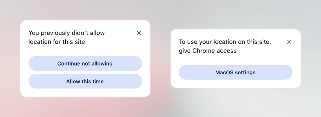
Progressive enhancement is also finding its way into core browser APIs that have historically proven cumbersome to implement. The traditional Geolocation API has long been a source of friction for web developers, largely due to the underlying hardware dependencies—such as GPS satellites, Wi-Fi triangulation, and cellular tower data—alongside the persistent frustrations associated with managing and modifying permission statuses once granted.
To streamline this process, the introduction of the <geolocation> HTML element aims to resolve many of these historical roadblocks. However, the new element is not without its unique quirks, notably introducing distinct styling restrictions that developers must navigate. Because browser support for <geolocation> is currently exclusive to Chrome, developers are relying on hybrid strategies—combining the new HTML element with the established JavaScript Geolocation API—to build robust solutions that can be deployed into production environments today without alienating users on other browsers.
MicroLighter and the Power of the Custom Highlight API
Syntax highlighting has traditionally relied on heavy JavaScript parsers or server-side rendering pipelines to inject a multitude of nested markup spans into code blocks. However, the emergence of the Custom Highlight API is beginning to shift this paradigm entirely.
Taking advantage of these modern web platform capabilities, developer Dave Rupert introduced MicroLighter, a lightweight syntax highlighter built directly around the ::highlight() pseudo-element. By decoupling styling from the underlying DOM structure, MicroLighter showcases how native browser features can handle text highlighting tasks with significantly improved performance and cleaner markup. The project has sparked widespread interest across the development community, with figures like Geoff exploring its practical implications and broader potential for performance-conscious web applications.
Extracting CSS Grid Layout Intelligence into Custom Properties
Layout engines have grown exponentially more powerful in recent years, yet bridging the gap between layout geometry and design token management has remained a challenge. Temani Afif recently demonstrated an innovative approach for extracting CSS Grid layout information directly into CSS custom properties. By capturing metrics such as the total number of rows and columns, as well as the precise X and Y coordinate indexes of individual grid cells, developers can unlock entirely new dimensions of responsive design.
While this technique currently relies on the condition that columns maintain equal widths, the ongoing evolution of CSS suggests that such constraints may soon diminish. Among the most exciting applications of this grid-to-variable workflow is the calculation of hover proximity, enabling developers to create spatial awareness and responsive interactive states directly within their style sheets.
The Dark Mode Debate: Two-State Versus Tri-State
As dark mode preferences become an expected standard across digital products, the debate surrounding how users toggle between light and dark themes continues to generate thoughtful discussion among interface designers. The conversation largely centers on whether applications should utilize a simplified two-state toggle or a more comprehensive tri-state system.
Design advocate Lea Verou has made a strong case for maintaining a streamlined two-state approach, while browser engineer Bramus advocates for the flexibility of a tri-state model. Meanwhile, alternative perspectives, such as the auto-until-overridden two-state methodology highlighted by Vale.Rocks, suggest that intelligent defaults combined with manual user overrides offer an optimal balance of automation and user control.
Future Selectors and Feature Detection Proposals
Bramus has also introduced several forward-looking proposals aimed at expanding the capabilities of stylesheet architecture. Among them is the class prefix selector, a straightforward yet highly efficient syntax designed to target multiple classes simultaneously without resorting to complex attribute selectors.
Traditional approaches often require verbose attribute selectors to match classes beginning with specific strings. These legacy methods can introduce performance overhead and readability challenges. The proposed class prefix selector offers a cleaner, more performant alternative for styling modular design systems. Although widespread browser support is not yet a reality, the simplicity and utility of the proposal suggest strong potential for future standardization.
In addition to the class prefix selector, Bramus highlighted the @supports named-feature() function. Currently supported in Chrome, this feature detection mechanism allows developers to query highly specific browser behaviors and implementation details—such as whether a browser respects specific layout transforms during anchor positioning—that were previously impossible to detect using traditional @supports queries. This enhancement promises to make feature detection significantly more versatile for developers working on the cutting edge of web standards.
Balancing Wrapped Flexbox Items
Rounding out recent platform updates, Chrome has introduced support for flex-wrap: balance, a feature that brings the distribution logic familiar from text-wrap: balance directly to flexible box layouts. Ahmad Shadeed explored the mechanics of this addition, detailing how developers can utilize balanced flex wrapping to prevent awkward, orphaned items on final rows and achieve more visually harmonious component layouts.
As autumn approaches, the continuous stream of enhancements across layout engines, interaction APIs, and stylesheet selectors signals a vibrant, forward-moving period for the web development community.

Leave a Reply