
As the development landscape enters a new season, the CSS community continues to push the boundaries of what is possible with native web platform features. The latest edition of the industry’s ongoing design digest highlights a wave of innovative solutions, experimental APIs, and modern implementations addressing long-standing front-end challenges. From smarter user interface interactions to advanced layout controls, recent weeks have seen prominent developers and community advocates introducing tools that promise to streamline codebases and elevate user experiences.
Among the prominent discussions is the eternal balancing act of interface feedback, specifically regarding tooltips. Developer Abhishek Jakhar recently examined the mechanics of tooltip timing, arguing that effective tooltips require a deliberate delay followed by an instant appearance. This pattern prevents accidental triggers when a user’s cursor merely sweeps across a screen, while ensuring that once dismissed, the interface responds immediately without frustrating lag. While implementing this behavior has traditionally required custom scripting, the approach requires careful calibration; if the hover-able region is too small, users can inadvertently de-trigger the tooltip, making a measured delay essential for usability.
Building on this concept, Chris Coyier demonstrated a modern implementation leveraging interest invokers, a forward-looking feature centered around two key CSS properties: interest-delay-start and interest-delay-end. While browser support for interest invokers is currently limited to Chrome, the technique represents a textbook application of progressive enhancement, allowing developers to adopt forward-thinking standards while maintaining robust fallback behaviors for other environments.
The <geolocation> Element and Modern Progressive Enhancement
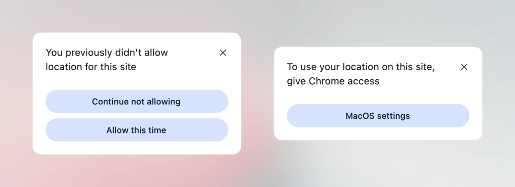
Progressive enhancement remains a central theme in modern web development, particularly as new HTML elements attempt to simplify complex browser APIs. Historically, implementing geolocation has involved managing intricate external hardware dependencies, including GPS satellites, Wi-Fi triangulation, and cellular towers, often resulting in frustrating user experiences when permission statuses needed to be modified later.
To address these hurdles, the new <geolocation> HTML element aims to streamline location requests natively, though it introduces a few unique quirks, notably strict styling restrictions. Because widespread browser support is still developing—with only Chrome currently supporting the element—developers are turning to hybrid strategies. By utilizing the new element alongside the established Geolocation API, front-end engineers can effectively deploy the functionality today, ensuring seamless cross-browser compatibility while preparing for future standards.
MicroLighter and the Evolution of Syntax Highlighting
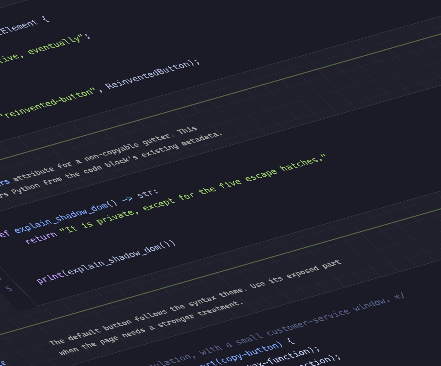
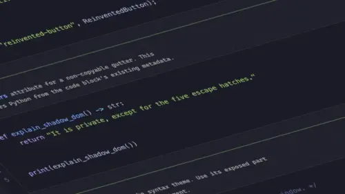
The front-end ecosystem has also seen exciting advancements in text styling and performance optimization through the Custom Highlight API. Developer Dave Rupert recently introduced MicroLighter, a lightweight syntax highlighter built directly on top of the ::highlight() function. Unlike traditional highlighters that heavily manipulate the Document Object Model by injecting numerous span elements, the Custom Highlight API allows developers to style ranges of text natively and efficiently. The introduction of MicroLighter has sparked broader community conversations about the practical applications of highlight-based styling, offering a glimpse into how performance-conscious developers can handle syntax coloring without bloated markup.
Extracting CSS Grid Information into Custom Properties
Layout manipulation and grid systems have likewise taken a significant leap forward. Temani Afif recently demonstrated a technique for transferring CSS grid layout information directly into CSS custom properties. This method allows developers to dynamically capture the total number of rows and columns, as well as the precise x and y index coordinates of individual grid cells.
While this capability currently requires columns to have equal widths, the rapid evolution of CSS suggests such constraints may soon loosen. Afif illustrated the immense potential of this technique by applying it to hover proximity calculations, enabling complex spatial awareness and proximity-based styling effects using modern CSS alone without relying on heavy JavaScript event listeners.
The Great Dark Mode Debate: Two-State or Tri-State?
User interface preferences continue to spark architectural debates within the design community, particularly concerning dark mode toggles. A notable discussion has emerged between Lea Verou, who advocates for a streamlined two-state toggle, and Bramus, who presents a compelling case for a tri-state approach. Meanwhile, alternative perspectives, such as the auto-until-overridden two-state model highlighted by Vale.Rocks, offer a nuanced middle ground that respects system preferences while giving users persistent manual control once a choice is made.
Emerging Selectors and Advanced Feature Detection
Bramus has also introduced the conceptual class prefix selector, a straightforward proposal designed to target multiple classes efficiently. Although not yet supported by any browser, the syntax offers a cleaner and more performant alternative to traditional attribute selectors. Where legacy approaches required complex matching rules to find specific substrings within class attributes, the proposed prefix selector simplifies the process significantly, leading industry observers to anticipate swift adoption once standardization discussions progress.
In addition to the class prefix selector, Bramus highlighted the @supports named-feature() function. Currently supported in Chrome, this function enables feature detection for highly specific browser behaviors that were previously undetectable. By allowing developers to query whether a browser respects specific edge-case layout rules—such as how transforms interact with anchor positioning elements—the named-feature() function expands the capability of feature queries across the web platform.
Balancing Flexbox Layouts
Layout refinement extends beyond grids into traditional flexible box layouts as well. Chrome has introduced support for flex-wrap: balance, bringing the distribution logic familiar from text wrapping to flex items. Ahmad Shadeed explored the practical applications of this new property, demonstrating how developers can automatically balance wrapped flex items evenly across multiple rows or columns. This addition eliminates awkward wrapping scenarios where a final row contains only a single stray element, resulting in cleaner, more aesthetically balanced user interfaces.
As these new features, APIs, and selectors gradually make their way from experimental implementations into broader browser support, the web development community stands on the brink of another transformative phase. With autumn arriving, the ongoing evolution of CSS continues to provide developers with the native tools needed to build more efficient, accessible, and expressive digital experiences.

Leave a Reply