In a bittersweet announcement for front-end developers and web designers across the community, the popular recurring feature What’s !important has published its final issue on CSS-Tricks.com. However, the farewell comes paired with a significant evolution for the platform’s direct-to-reader communications. Rather than disappearing entirely, the publication is set to return in a newly expanded and reimagined format as the official CSS-Tricks newsletter, bringing a fresh wave of curated industry insights directly to subscriber inboxes.
The relaunch, scheduled to officially kick off on November 10th, marks the end of a surprisingly lengthy four-year hiatus for the newsletter format on the site. Following the recent revitalization and return of CSS-Tricks under new ownership earlier in the week, the editorial team is wasting no time in reviving one of its most cherished community staples. Organizers promise that the revitalized publication will feature hand-written and hand-curated news, links, and editorials that cannot be found anywhere else on the main web portal. To celebrate the transition, the final on-site installment of What’s !important serves as a massive send-off, packed with a robust backlog of material collected prior to the site’s recent relaunch alongside a fresh slate of modern web development highlights.

Among the standout features in this grand finale is a nod to Rockstar Games, which has entered the conversation regarding advanced web scrolling effects—arguably with a thirteen-year head start in development anticipation. The release of the official Grand Theft Auto VI website, which famously runs into compatibility issues on Mozilla Firefox, has captured the attention of the web development community. Developer Kevin Powell recently published a detailed walkthrough breaking down the site’s impressive scroll effects, offering web enthusiasts an engaging distraction while the gaming world continues its prolonged wait for the title’s official release.
Beyond high-profile entertainment sites, the final issue highlights significant technical advancements in modern CSS and HTML. Mojtaba Seyedi recently demonstrated how developers can build a fully functional scrollspy using modern CSS capabilities. For those unfamiliar with the term, a scrollspy dynamically highlights a navigation menu link corresponding to the specific section of a webpage currently in view, significantly improving user orientation during long-form reading experiences.
The conversation around modern CSS continued with Brecht De Ruyte showcasing and explaining a series of striking visual demos utilizing the newly introduced random() CSS function. These demonstrations lean into playful imperfection, showcasing how native randomness within stylesheets can alter layout characteristics, spacing, and visual aesthetics without relying heavily on JavaScript workarounds.
Meanwhile, Lea Verou delivered an extensive deep dive into the evolving landscape of implementing icons on the web for 2026 and beyond. Verou’s analysis explores upcoming CSS features designed to streamline icon integration, touching on advanced concepts such as Linked Parameters, the ident() function, @mixin and @apply rules, and the @property shorthand. These prospective additions point toward a cleaner, more modular future for component styling and design system architecture.
Addressing foundational CSS architecture, developer Kilian Valkhof proposed the introduction of a universal pseudo-selector. While the traditional universal selector (*) targets all elements on a page, it historically fails to target pseudo-elements like ::before and ::after. Because modern web development increasingly relies on global rules such as box-sizing: border-box applied across both standard elements and a growing number of pseudo-elements—including newer additions like ::backdrop and ::details-content—Valkhof suggests the adoption of a ::* syntax to cleanly capture these hidden nodes.
In the realm of design systems, Declan Chidlow highlighted several critical new HTML and CSS features that teams should immediately incorporate into their component libraries. Among the standout capabilities are properties and functions such as text-box, sibling-index(), sibling-count(), @scope, and @custom-media, all of which provide unprecedented control over layout scoping and typographic metrics, proving invaluable both within and outside formal design system frameworks.

Form controls and layout helpers also received notable updates. Adam Argyle shared a clever technique utilizing modern anchor positioning to make <textarea> elements automatically adapt their height to their content, mimicking the natural behavior of contenteditable elements. Similarly, Temani Afif explored the creation of dynamic, wavy dividers by combining the random() function with the shape() property, pushing the boundaries of geometric layout design entirely through native stylesheets.
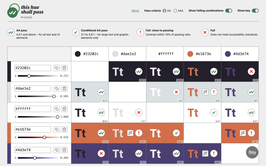
Tooling and accessibility updates formed another major pillar of the final on-site dispatch. Clearleft introduced a fresh color contrast checker titled This hue shall pass. Unlike standard evaluation tools, this utility allows developers to analyze every combination within a palette, explicitly distinguishing between complete failures and shades that are nearly compliant, while offering interactive lightness adjustments to help designs meet strict AA and AAA accessibility standards.

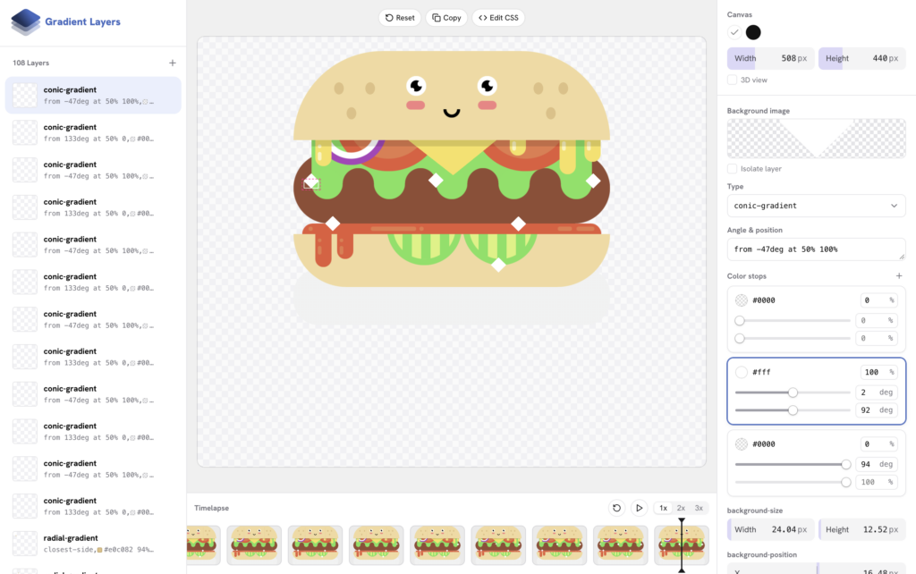
Concurrently, Ahmad Shadeed expanded developer tooling with the release of Gradient Layers, a visual gradient visualizer hosted on his laboratory platform. The tool allows creators to build and edit complex, multi-layered gradients visually, removing the friction of manually writing intricate CSS syntax. Building on the momentum of visual styling, Josh Tumath outlined the technical specifications for two upcoming native gradient types currently making their way through the W3C CSS Working Group drafts: mesh gradients and freeform gradients. Illustrated through early code syntax and visual explainers, these advanced gradient models promise to bring rich, organic color blending natively to the web platform without requiring heavy raster images.
As CSS-Tricks turns the page on this era of its publication history, the community prepares to migrate to the dedicated newsletter format. While future issues will feature the same high-caliber front-end writing and platform updates, they will arrive via direct delivery to subscriber inboxes. The transition ensures that the publication can continue its long-standing tradition of supporting developers while adapting to the modern publishing landscape.