
Nearly ten years after its initial introduction to the web ecosystem, the native HTML <dialog> element continues to be a cornerstone of modern web architecture, yet it frequently sends developers back to their search engines. Despite its longevity, working with native dialogs involves a surprising amount of nuance regarding states, styling, accessibility, and browser behaviors. A proper examination of this architecture reveals why this seemingly simple element remains a vital topic for front-end engineers looking to build robust, accessible web applications.
Marking up a <dialog> Element
At its most fundamental level, implementing a dialog requires minimal markup, pairing a trigger button with the dialog element itself. By default, the dialog remains closed when the page loads. While developers can manually apply an open attribute directly in the HTML to force it open upon rendering, this represents a rare use case. Instead, developers typically rely on JavaScript methods to control visibility programmatically.
Invoking the standard show() method opens the element, but it treats the dialog more like a traditional pop-up rather than a true modal. The distinction is critical for user experience. A modal dialog automatically incorporates a backdrop, positions itself precisely in the center of the viewport, and listens for the escape key to facilitate dismissal. The basic show() method bypasses these critical modal behaviors, making the showModal() method the preferred approach for most interactive scenarios.
Managing the Closing States
Once a modal dialog is active, pressing the escape key while the element is in focus naturally closes it. To build custom user interface elements inside the dialog—such as a dedicated close button—developers must integrate explicit handling. While a JavaScript click listener can invoke the dialog’s close() method, developers can also take a declarative approach directly within the HTML markup by embedding a form with a designated method and submit button.

Beyond these standard methods, the web platform is actively exploring experimental features known as invoker commands. These evolving standards are designed to streamline how developers open and close dialogs, popovers, and other top-layer elements entirely through declarative HTML attributes like command and commandfor. While these capabilities roll out across modern browsers, developers continue to monitor baseline status support closely while pairing them with traditional event listeners in JavaScript to track state changes and manage application logic.
Prioritizing Accessibility and Focus Management
When designing interactive components, button labeling plays a pivotal role in ensuring assistive technologies convey accurate information to users. Utilizing a simple icon or a standalone character inside a close button can create ambiguity for screen readers. To maintain high accessibility standards, developers often pair visual symbols with hidden text spans to ensure screen readers announce a clear description of the action, such as closing the modal.
Focus management also demands careful consideration. When a dialog opens, focus automatically shifts to the first focusable element inside, which is frequently the close button. While functional, this can occasionally lead to unexpected closures if a user inadvertently triggers the space bar. Depending on the contents of the modal, developers may choose to direct initial focus to other interactive elements, such as a primary form field or a relevant link, using appropriate tab indexing attributes.
Understanding Innate Inertness and the Top Layer
One of the most powerful characteristics of a modal dialog is its innate inertness. When a modal opens, the underlying webpage automatically becomes inert, meaning all background interactions—including text selection, button clicking, and focus navigation—are temporarily disabled. This vital security and usability feature prevents users from interacting with background content while an active modal demands their attention.

This behavior strictly applies to true modals instantiated via showModal(). Elements opened via standard pop-up methods do not trigger background inertness, operating more akin to lightweight tooltips. When multiple overlay elements compete for attention, the browser manages the top layer strictly, ensuring that background elements remain inaccessible until the active modal is dismissed.
Styling the Backdrop, Borders, and Positioning
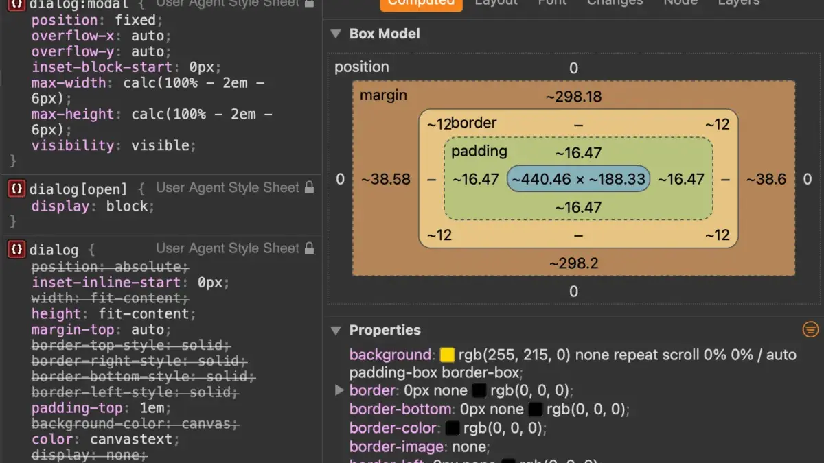
Styling the default presentation of a dialog requires careful attention to browser user-agent stylesheets. The default backdrop styling provides a subtle tint that can easily go unnoticed against complex background designs. Developers can leverage the dedicated pseudo-element to apply custom background colors, transparency, or even modern blur effects to contextualize the foreground content.
Similarly, overriding the default browser styles requires targeting the dialog in its active state. Because user agents apply default rules to closed elements, applying custom borders, background colors, and border radii is most effectively achieved by targeting the open attribute or utilizing the high-specificity modal pseudo-class.
Managing background scrolling while a modal is open has historically required workarounds, such as dynamically hiding overflow on the document body. Recent browser updates have introduced expanded support for properties like overscroll behavior, allowing developers to manage scrolling constraints more declaratively. By combining these modern properties with proper overflow handling, developers can prevent background content from shifting or scrolling out of context when a user engages with a modal interface.

Animating Dialogs Into and Out of View
Animating dialogs as they enter and exit the viewport requires navigating how browsers handle elements that transition from a non-rendered state. Because a closed dialog is effectively removed from the active layout flow, standard CSS transitions alone are insufficient for handling entry animations.
To achieve smooth fade-in effects, developers rely on specialized at-rules that establish explicit starting styles for elements as they render in the document object model. This allows the browser to calculate transition paths accurately from an initial hidden state to a fully opaque active state. While view transition APIs offer exciting possibilities for page navigation, modal dialogs residing in the top layer often present unique challenges for traditional transition pairs, making standard CSS transitions and keyframe animations the reliable choice for open and close sequences.
Choosing Between Dialogs and Popovers
Deciding whether to implement a native dialog or a popover depends heavily on the specific requirements of the user experience and accessibility mandates. While the two APIs share structural similarities, they serve fundamentally different purposes. Popovers lack the innate focus-trapping and background-inerting behaviors built directly into the dialog element.
Implementing a custom popover that requires modal-like behavior forces developers to manually program focus management and background restrictions using JavaScript, alongside assigning explicit accessible roles. Consequently, choosing the correct API ensures that web applications remain accessible, performant, and aligned with modern web standards without requiring excessive custom boilerplate.


Leave a Reply