
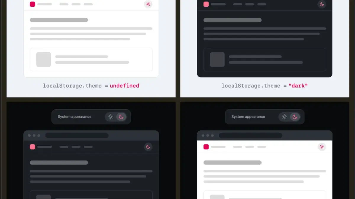
The eternal debate over website user interface design has taken a delightfully nerdy turn, touching on a small yet ubiquitous feature found across millions of web pages: the light and dark mode toggle. For years, web developers have defaulted to a standard implementation for color scheme preferences, typically offering users three distinct options via a persistent interface element: Light, Dark, and System.
However, prominent web developer and designer Lea Verou is pushing back against this conventional pattern. In a recent and widely discussed exploration of dark mode toggles, Verou argues that displaying three separate state options for visitors is often unnecessary clutter. Instead, she champions a more streamlined approach, asserting that a well-designed two-state control can effectively express all three required scenarios without imposing cognitive overload on the user.
The core of Verou’s argument centers on how users actually interact with color scheme controls. When a visitor arrives at a website with no prior preference saved, the site should naturally fall back to their operating system settings. If the user wishes to change this behavior, they only need to apply an override the first time it becomes relevant to them. That preference is then securely stored in the browser’s localStorage for all future sessions.
By eliminating the redundant "System" option from a persistent navigation bar, designers can reduce visual noise. As Verou points out in her detailed analysis, a good two-state control can handle the fallback and the manual override seamlessly. The visitor simply toggles the theme when they want a change, and the system respects that choice moving forward.
This perspective has sparked significant conversations across the web development community, resonating with designers who advocate for minimalist interface principles. The philosophy relies on the idea that less UI—when it accomplishes the exact same functionality as a more crowded interface—is fundamentally a better user experience. Persistent UI elements, such as those permanently pinned to a site’s header or main navigation menu, carry a heavy responsibility. They occupy prime real estate and demand a fraction of the visitor’s attention every time they load a page.
When navigation bars are packed with multiple options, they risk introducing unnecessary cognitive dissonance. Theme-switching, as Verou notes, is entirely tangential to the actual user goal of visiting a website in the first place. Whether a user is reading an article, shopping, or researching, tweaking color schemes is a secondary or even tertiary action. Even if a user’s intent shifts or diverges—such as wanting to pin a light theme permanently instead of reverting to a system-controlled light mode—the divergence only becomes apparent when the operating system eventually switches to dark mode. At that precise moment, fixing it is a single click away. It is such an effortless adjustment that spending valuable interface space on a permanent tri-state menu becomes difficult to justify.
The discussion surrounding Verou’s proposal has also brought broader browser-level frustrations to light. Participating in the discourse on decentralized social platforms, web professional Chris Coleman highlighted a deeper systemic issue regarding how modern browsers handle operating system preferences. Coleman pointed out that many users simply want their underlying operating system to run in dark mode for system-level legibility, rather than forcing every independent website they visit into a dark color scheme. The blanket assumption by browser vendors to tightly couple web content rendering to system-wide preferences has created friction for web consumers. Coleman suggested that a more appropriate long-term solution would be for comprehensive light and dark mode preferences to live natively within the browser controls themselves, which would naturally validate Verou’s streamlined approach for individual web properties.
Despite her strong preference for two-state controls, Verou acknowledges that tri-state options are not entirely obsolete. She has outlined specific scenarios where a three-state control remains appropriate, maintaining that rules in UI design must always be context-aware rather than dogmatic.
The conversation generated by Verou’s initial post quickly gained momentum, prompting her to publish a comprehensive follow-up piece that synthesized the varied feedback from designers, developers, and users. The consensus emerging from the broader debate reinforces the idea that guidance on minimalist toggles applies specifically to persistent UI elements—those ever-present controls found in main navigation headers. For sites utilizing this common pattern, shifting toward a clean two-state mechanism offers a cleaner aesthetic and a smoother interaction model.
Ultimately, the most radical and perhaps effective solution proposed within the ongoing design dialogue may be the simplest one of all: removing the toggle entirely. By respecting system defaults gracefully and stepping out of the visitor’s way, websites can deliver a seamless experience that lets content take center stage without requiring manual intervention.



Leave a Reply