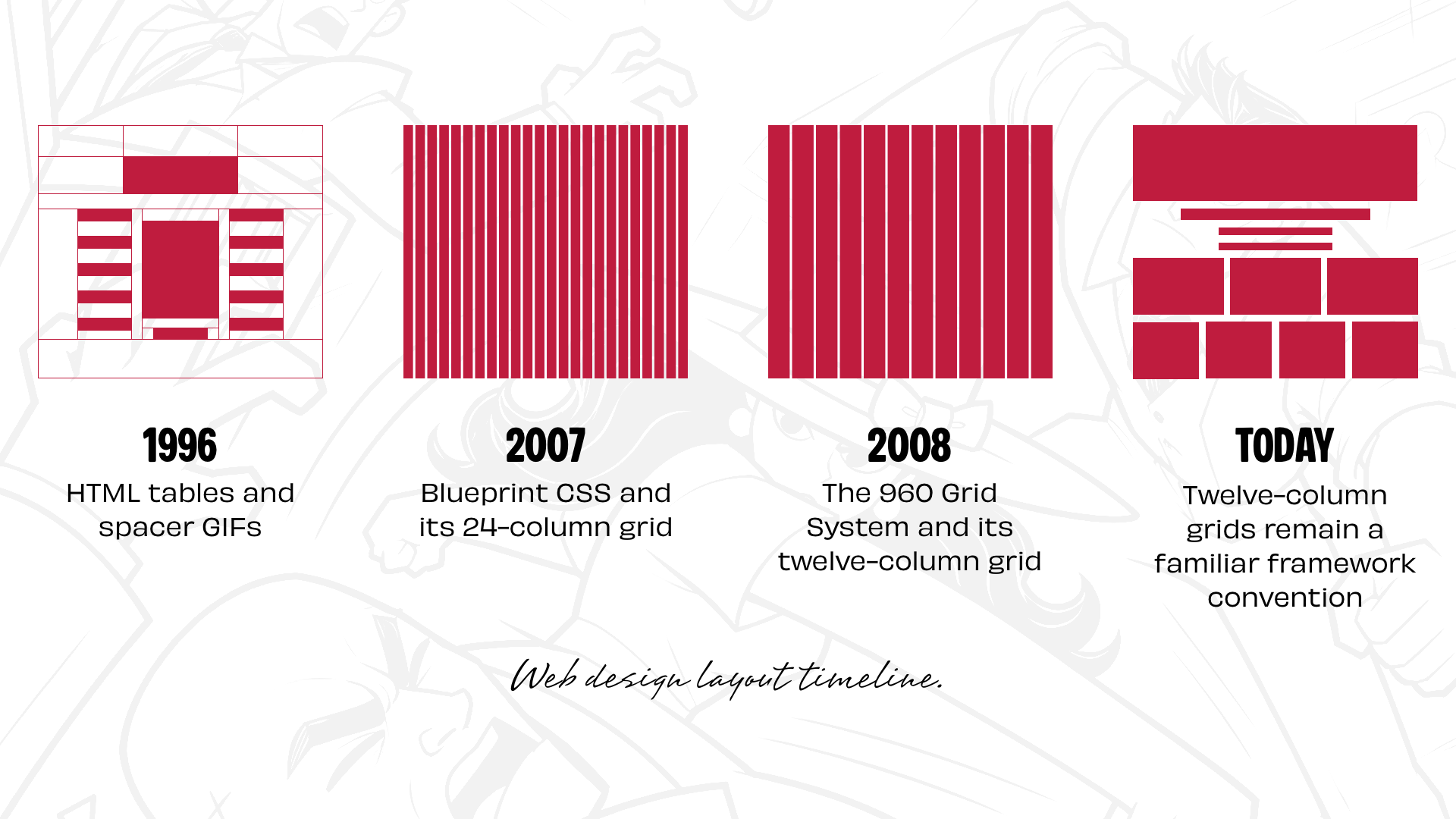
When website design first emerged as a distinct digital discipline three decades ago, pioneers relied heavily on whatever technical workarounds were available. Early designers turned to HTML tables and spacer GIFs—techniques popularized by David Siegel’s seminal text Creating Killer Web Sites—to structure and align page elements. As Cascading Style Sheets (CSS) evolved, layout control shifted toward floats and positioning. While neither mechanism was originally intended for complex page architecture, and inconsistent browser behavior frequently caused significant frustration, generations of designers nonetheless adopted floats and positioning to build the web.
The landscape shifted again when CSS frameworks introduced ready-made grid systems, streamlining the implementation process. Blueprint CSS offered a standardized 24-column grid, while Nathan Smith’s 960 Grid System popularized 12- and 16-column layout options. These frameworks provided developers and designers with a shared structural foundation, making layout planning considerably more efficient across different projects and teams.
The widespread adoption of a twelve-column structure did not originate in the digital era, however. Graphic designers had relied on column-based and modular grids for decades prior. Twelve proved to be a mathematically convenient figure because it allows for straightforward division into halves, thirds, and quarters—the underlying architecture behind the ubiquitous 2-up, 3-up, and 4-up visual components that populate modern web applications.
As prominent frameworks like Bootstrap and Foundation gained momentum, twelve-column grids cemented themselves as the de facto standard for digital page layouts. The rationale behind this ubiquity is clear: predictability and speed. Yet, somewhere along the evolution of web design, this single layout option transitioned from being a helpful tool into the default starting point for nearly every digital project.
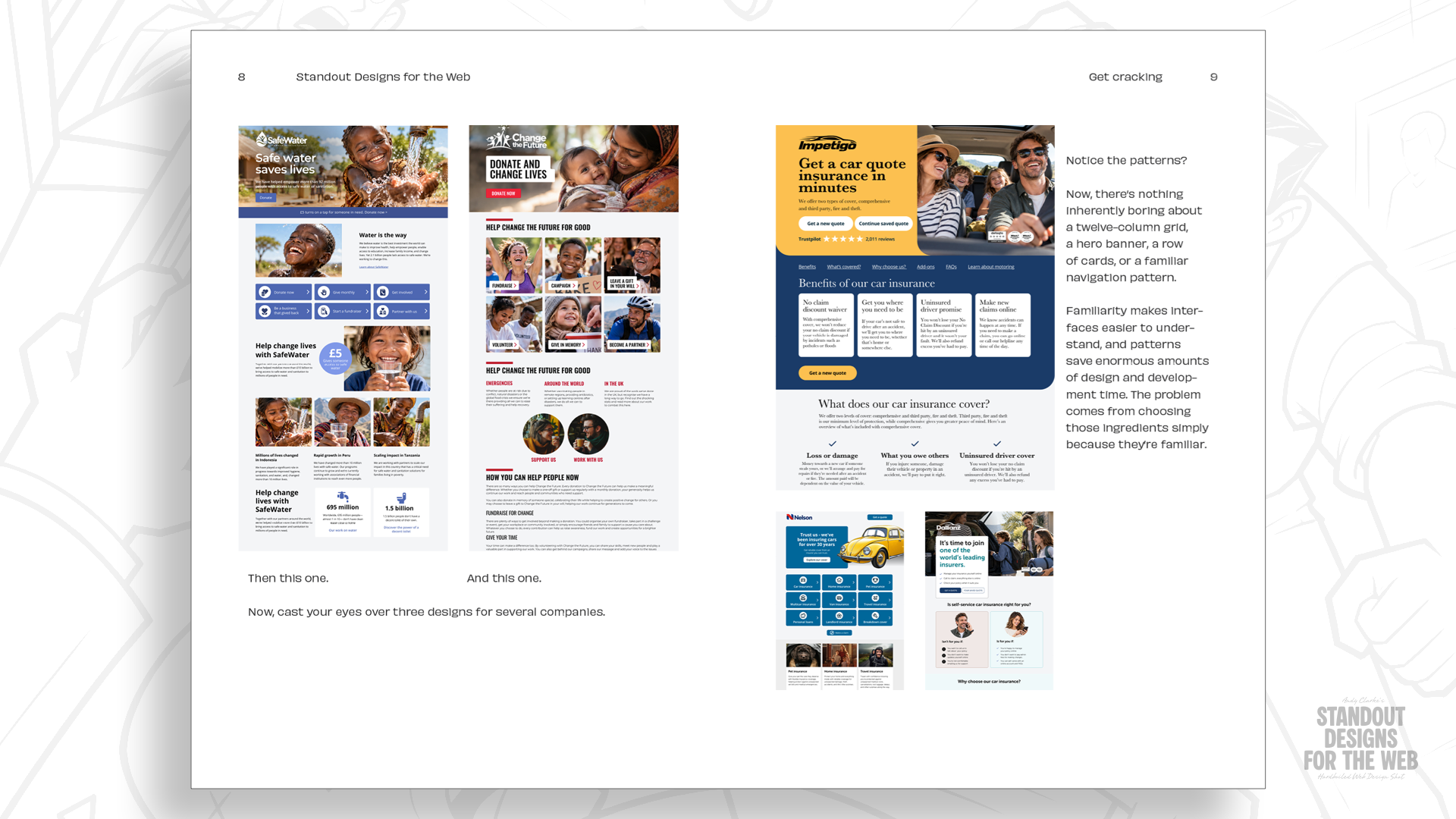
Even with the advent of CSS Grid, which fundamentally transformed the technical boundaries of what is possible on a webpage, a familiar pattern persists. Designers frequently begin a project by dividing a canvas into twelve equal columns before attempting to force their content into those predetermined boxes. While the resulting websites are often polished and functional, they can also look remarkably uniform, sharing a visual sameness across entirely different brands and industries.
Industry veterans suggest that the twelve-column grid itself is not inherently flawed. Instead, the challenge lies in reaching for a familiar blueprint out of habit before taking the time to evaluate what makes a specific company distinctive and what its digital platform needs to communicate. Shifting the foundational question from "How do we fit this content into columns?" to exploring the core narrative of a brand changes the trajectory of the design process entirely.
Every Company Has a Story Worth Telling
Before determining the appropriate column count or structural framework for a website, designers benefit from thoroughly understanding the organization they represent. Key inquiries involve identifying what sets a company apart from its competitors, determining what impression it wants to leave on visitors, and understanding whether its internal personality should dictate the look and feel of its digital presence.
Layout choices accomplish far more than merely arranging text and images. The physical scale, spatial positioning, and relational dynamics between different design elements dictate how users emotionally and mentally experience a platform. A restrained, orderly composition communicates an atmosphere vastly different from a layout driven by kinetic energy, asymmetry, and movement.
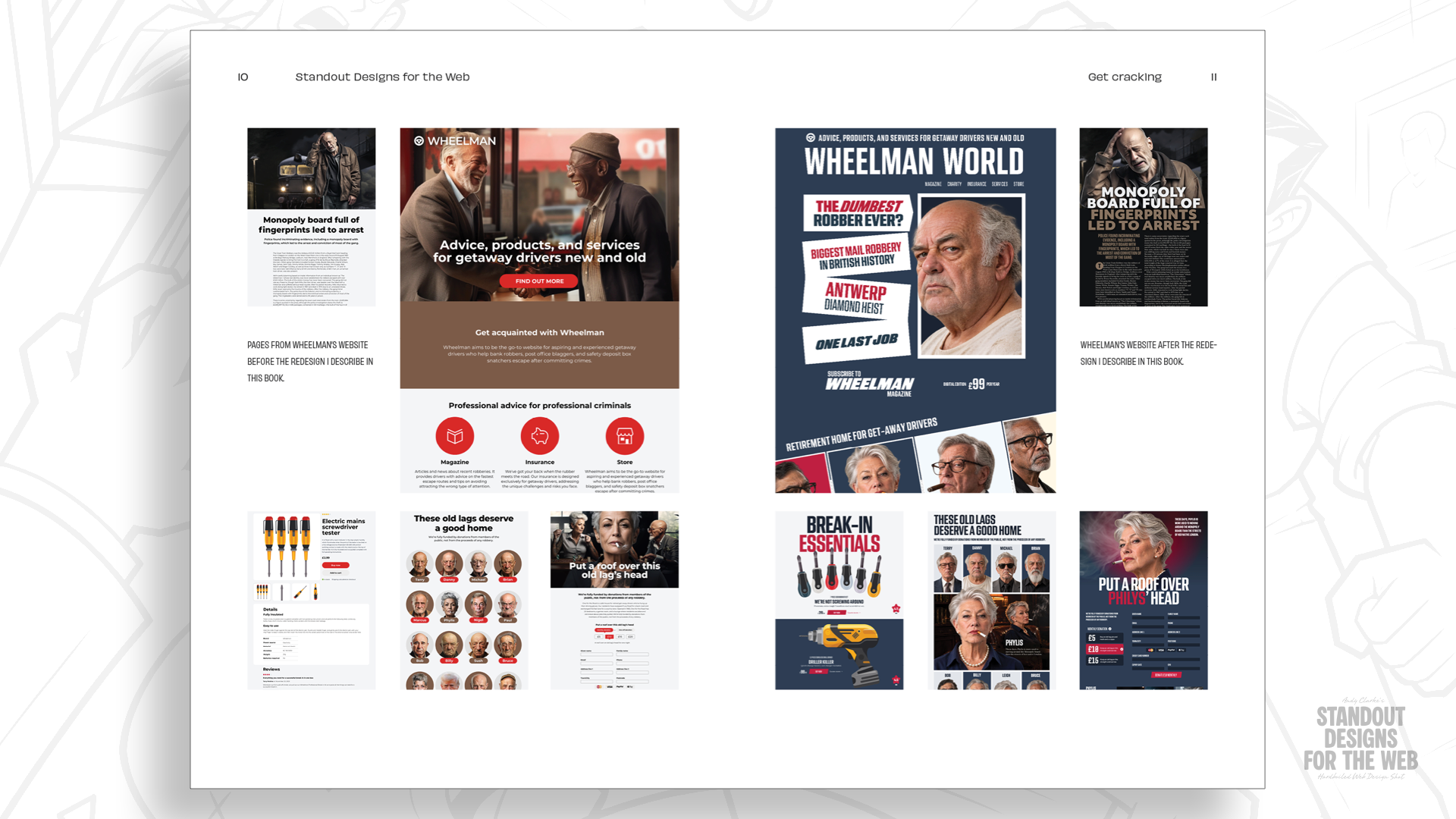
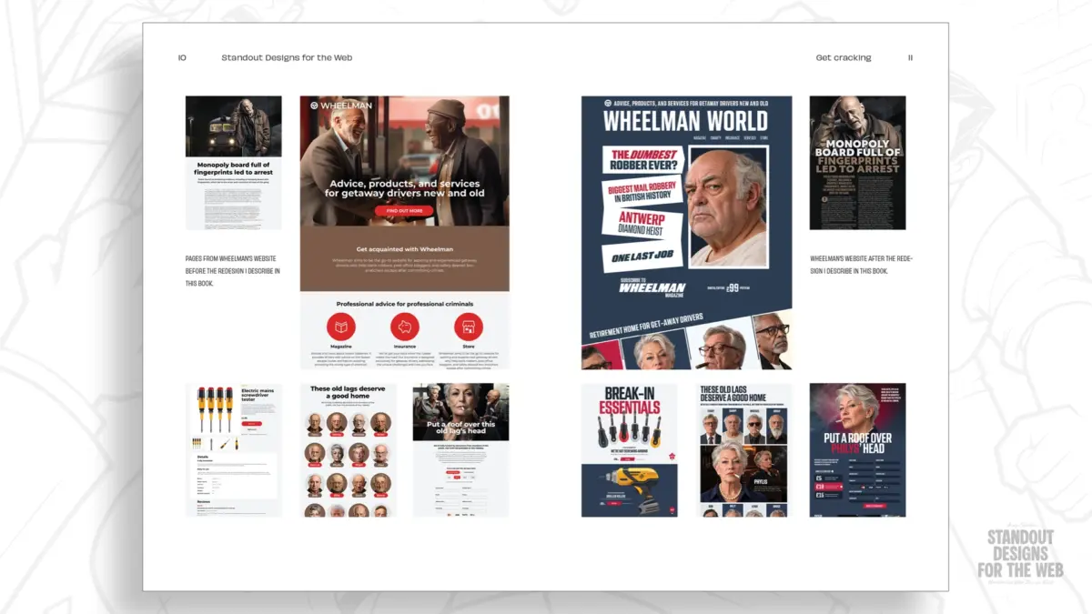
To illustrate how unconventional spatial relationships can reinforce brand identity, design educators often turn to hypothetical case studies. One such example is Wheelman, a fictional enterprise featured in the forthcoming publication Standout Designs for the Web. Wheelman is conceptualized as a provider of specialized products and services tailored for getaway drivers, ranging from legal advisory and specialized robbery insurance to an e-commerce storefront offering break-in essentials. The company also publishes an editorial magazine featuring advice, news, and narratives from life behind the wheel.
While Wheelman is entirely fictional, the practical design challenges it presents reflect real-world commercial complexities. The enterprise occupies an unconventional space: it operates with serious professionalism to serve a clientele of criminals who demand reliability, yet it maintains a distinct, rebellious personality. A standard e-commerce grid would fail to capture the unique tension and character of the brand.
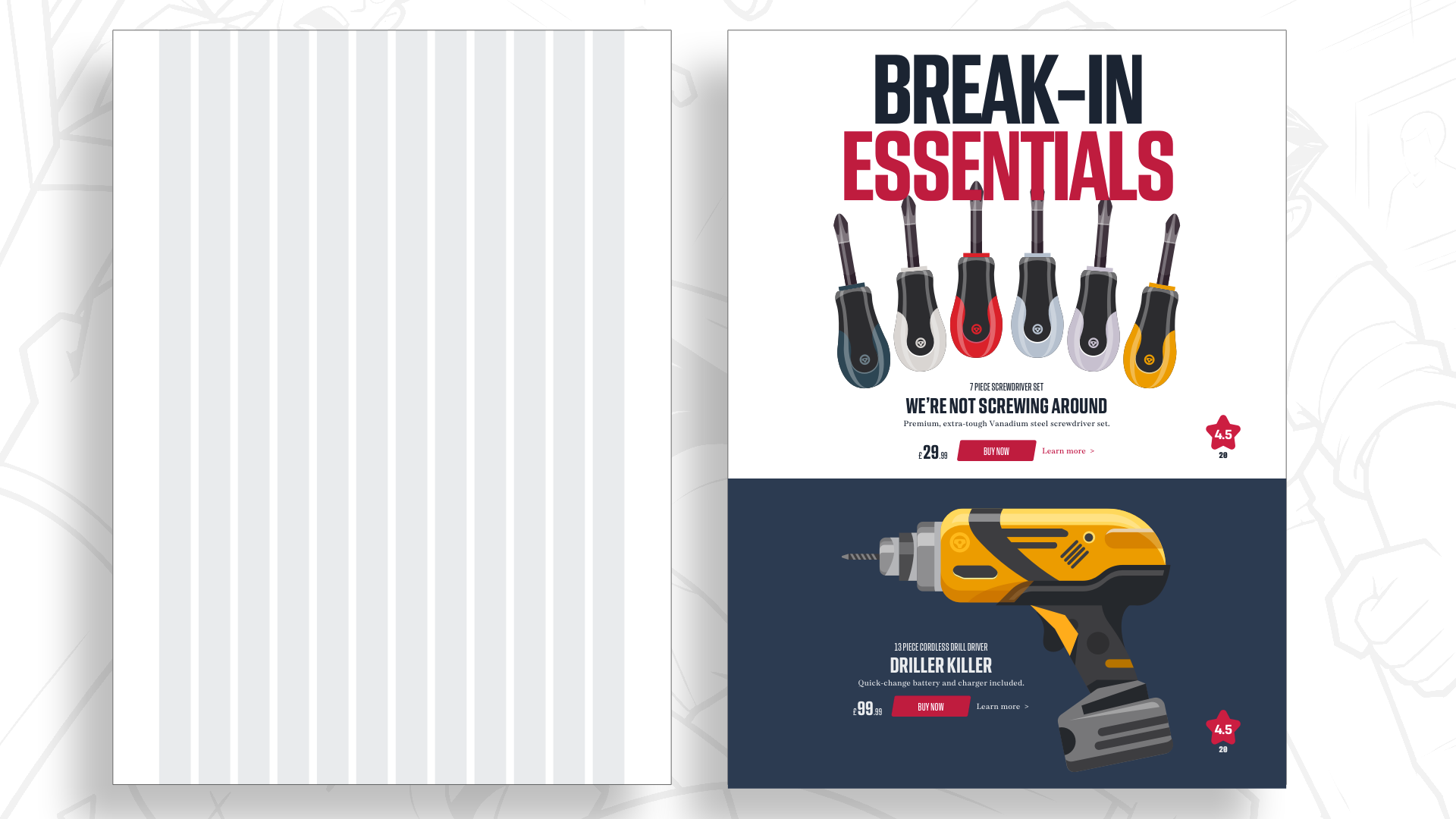
Embracing a tailored layout does not mean sacrificing usability or abandoning clarity. Customers still need to locate information efficiently, understand available services, and complete transactions securely. However, those functional experiences can be made significantly more memorable by selecting spatial arrangements that align with the true nature of the organization rather than defaulting to generic templates.
Starting with Content, Not Columns
Consider the process of constructing a modern product landing page for the Wheelman online shop. A typical page layout might feature multiple distinct items, prominent product imagery, oversized headings, and the standard functional information expected in digital retail environments.

Rather than immediately mapping these components onto a rigid grid, designers can begin by analyzing the intrinsic relationships between the items. Important early considerations include evaluating whether a large-scale photograph effectively sets the commercial tone, determining if the introductory copy warrants heightened visual prominence, and exploring how generous whitespace can guide the human eye and create moments of visual pause.
Choosing a straightforward single-column layout offers certain advantages, such as simplifying responsive design adjustments across varying screen dimensions. However, for a brand defined by a rebellious and energetic identity, a single-column flow may fail to communicate the appropriate atmosphere. At the same time, arranging products in two equal-width columns grants both items identical visual weight, which may conflict with the desired editorial hierarchy.

Adjusting the proportions between columns creates an immediate visual hierarchy without altering the fundamental size of the underlying elements. For instance, shifting a two-column split to a two-thirds and one-third proportion draws primary focus toward a designated hero product while maintaining overall compositional balance. While these proportional divisions can technically be mapped onto a traditional twelve-column grid, columns inherently divide space only along a single vertical axis, leaving designers searching for a multi-dimensional approach.
Adding Another Dimension with Modular Grids
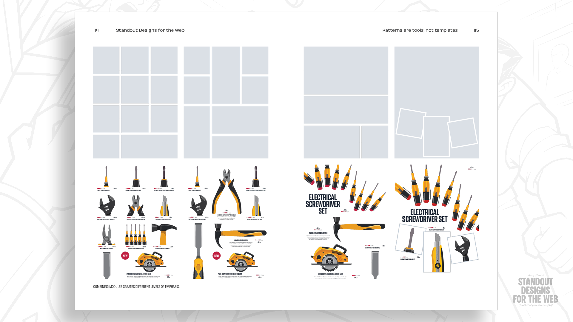
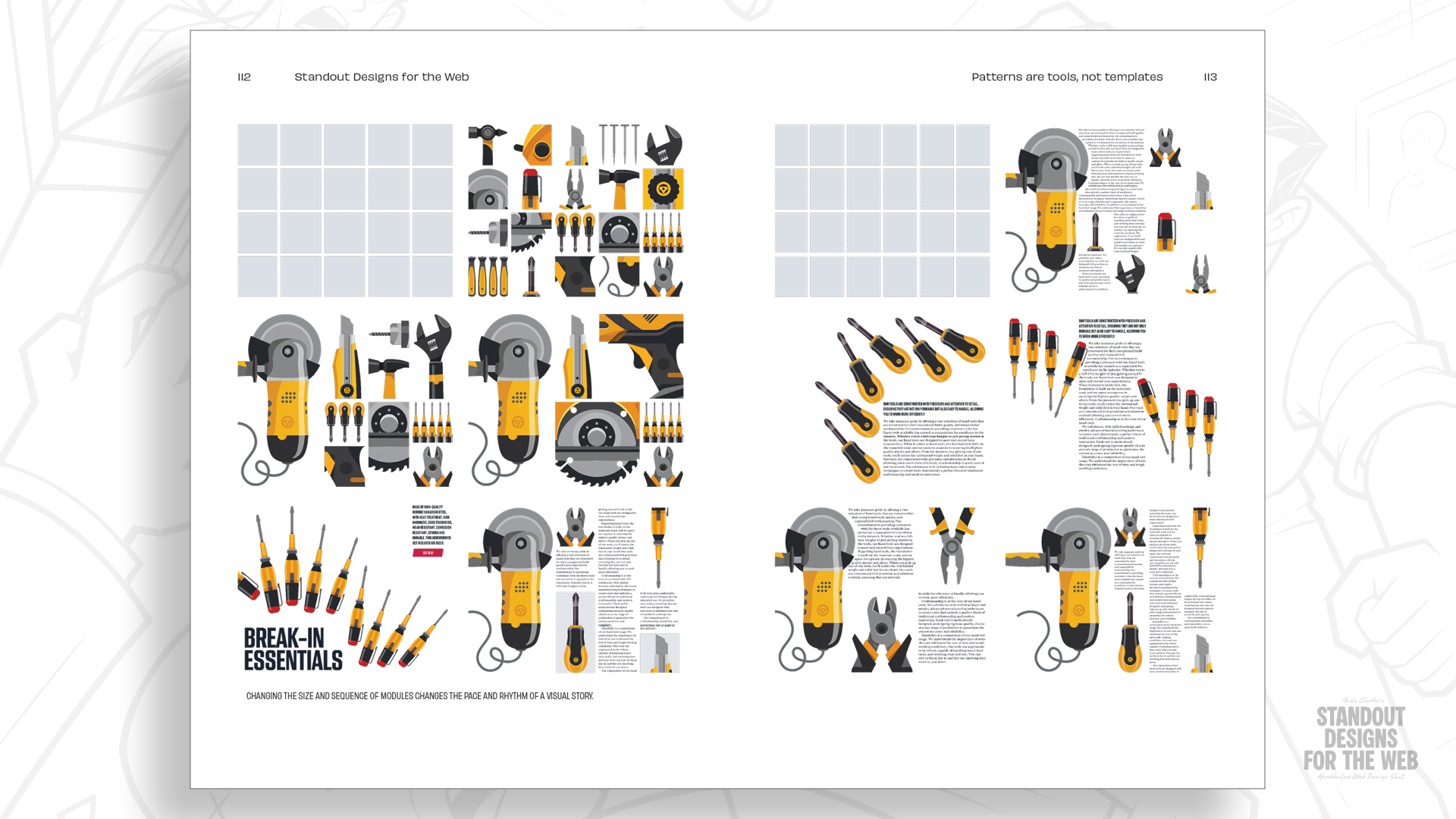
While dividing a canvas into vertical columns provides a functional starting point, the inclusion of horizontal rows introduces a second spatial dimension, unlocking a broader array of creative possibilities. Where vertical columns and horizontal rows intersect, they form distinct rectangular or square units known as modules.
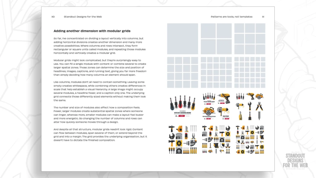
The combination of these individual modules allows designers to construct larger spatial zones capable of establishing clear visual hierarchy, controlling whitespace, and injecting structural variety into a composition. By employing a modular grid, creators can introduce dynamic tension, vary the scale of elements, and craft layouts that feel deliberate rather than predictable.
Beginning with a foundation of four columns and four rows yields a total of sixteen distinct modules, though a designer is under no obligation to utilize every single space. A large graphic headline and primary product image can be spanned across four modules to create immediate visual impact, while product descriptions and transactional tools can occupy individual modules nearby.
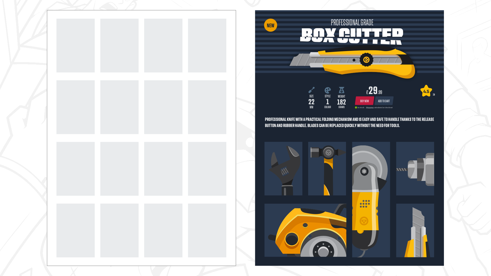
This modular philosophy extends naturally into product galleries and secondary listings. By allowing some items to occupy a single module while others expand horizontally or vertically across two, the overall interface gains variety and nuance. The resulting page preserves a clear reading order and provides adequate breathing room for the content, while unmistakably reflecting the distinct character of the brand.
Because fixed modular layouts rarely translate perfectly across every possible screen resolution, designers adjust module dimensions and quantities in response to varying viewports, ensuring the reading experience remains optimized. This flexibility multiplies exponentially when designers move beyond single grids and begin combining multiple structural frameworks on a single canvas.
Mixing Grids to Create Compound Grids
Achieving variety across a sprawling digital property requires moving past repetitive templates. An organization like Wheelman maintains distinct sections—including an editorial magazine, an e-commerce shop, and specialized client services—that serve entirely different communicative functions. Forcing all of these disparate sections into the exact same structural template dilutes the user experience.
Compound grids provide the necessary internal organization while accommodating unconventional spatial arrangements. A compound grid is formed by overlaying, stacking, or placing side by side two or more distinct grid types, such as column grids, modular grids, or hierarchical grids. The resulting intersections generate creative possibilities that neither grid system could achieve independently.
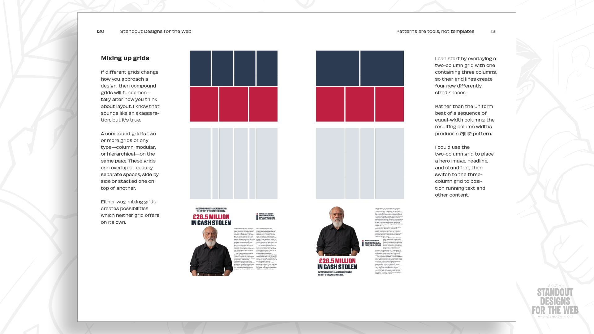
For example, overlaying a two-column grid with a three-column grid creates an underlying network of four columns featuring two distinct widths. These varied proportions provide enhanced flexibility for organizing content, allowing a wide span to accommodate a prominent photograph or headline, while a narrower adjacent space houses a pullquote or supplementary detail. Another page within the same digital ecosystem can utilize that exact underlying compound structure while rearranging the internal elements to suit a different editorial piece.
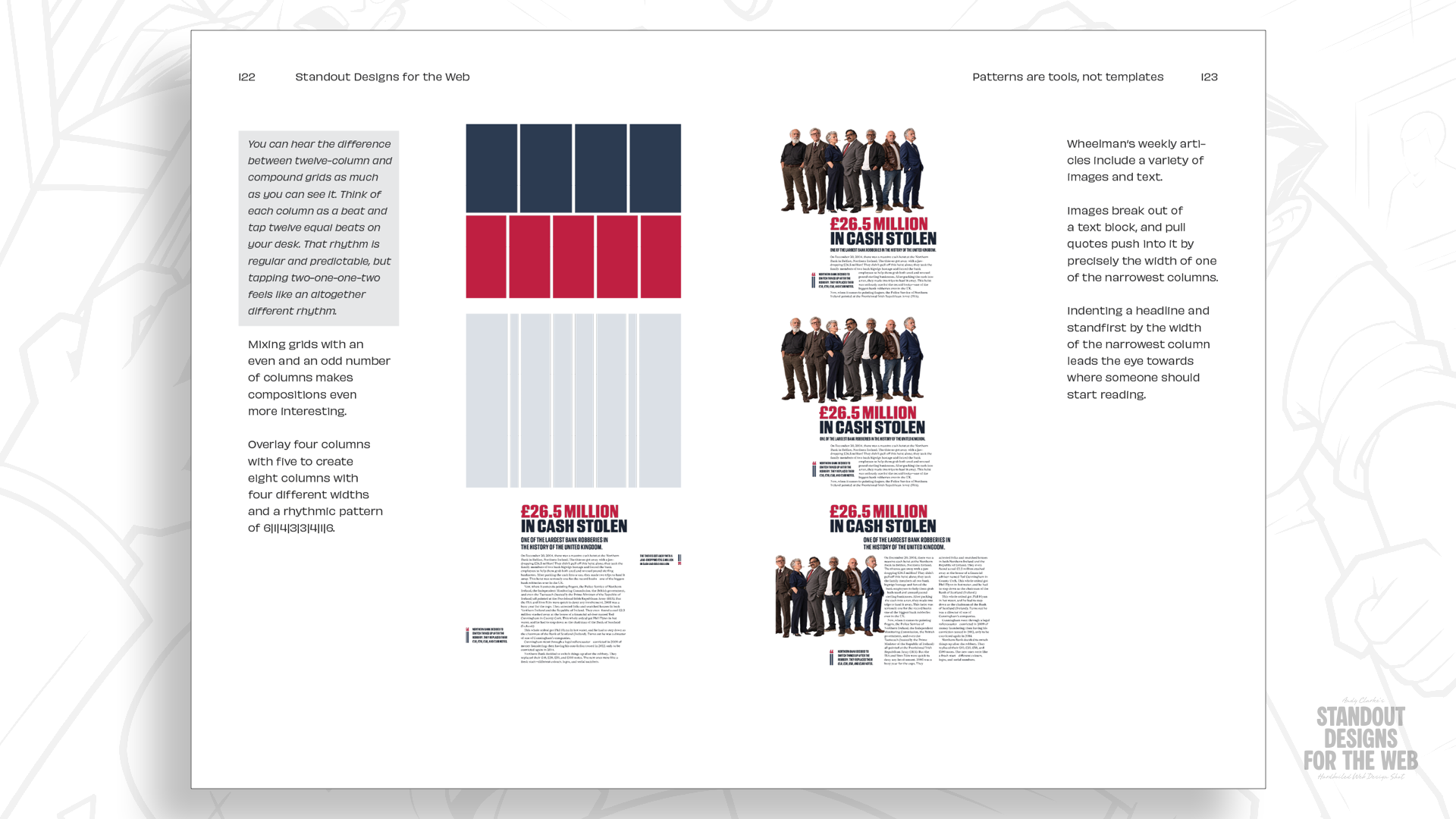
Expanding this methodology by combining grids with higher, differing column counts—such as mixing four- and five-column structures—allows for diverse compositional variations across multi-page websites while maintaining a cohesive visual language. The ultimate objective is never to force artificial differences into a design simply for the sake of novelty, but rather to ensure that each specific section features a layout tailored directly to its content.
Avoiding the Trap of Familiarity
Twelve-column grids remain a valuable asset in the modern web designer’s toolkit, and abandoning them entirely is neither practical nor necessary. However, recognizing them as merely one option among many prevents designers from artificially restricting their creative potential before the storytelling process even begins.
While the familiar 2-up, 3-up, and 4-up patterns inspired by twelve-column grids frequently serve a functional purpose, defaulting to them automatically leaves little room for the unique personality that transforms standard websites into memorable digital experiences. Projects featuring strong brand narratives provide ample justification for exploring alternative layouts tailored specifically to their contents.
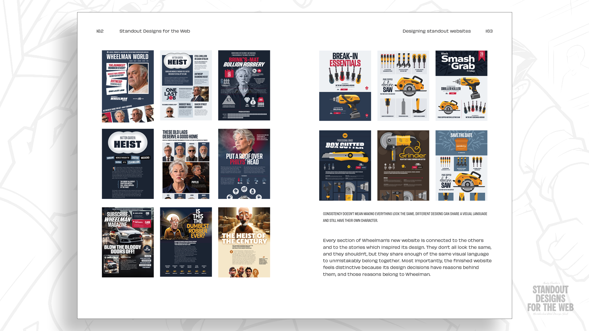
This intentional approach extends far beyond structural layout, influencing typographic selections, color palettes, commissioned imagery, and the synthesis of every visual component on the page. Encouraging creators to look beyond habitual solutions fosters more deliberate decision-making, ensuring that digital platforms truly reflect the distinct identities of the organizations behind them.
Pre-orders for the book Standout Designs for the Web are currently open through the CSS-Tricks store, priced at $14.99 for DRM-free EPUB and PDF editions ahead of its November 20 publication date.